For Questhouse we built a site that shows when the room is free and lets you book an hour straight away, with no phone call and no account.
How did we help::
- UX/UI
- Development
- Booking System
Client
Industry
"The Madness of Genius" is an escape room that spends sixty minutes putting its players inside the world of the painter Vincent van Gogh. People open the site with one question: when is there a free slot. The site does not keep them waiting.
The site carries the whole path from the question to the confirmation, without handing it off to a phone call or an email.
steps to a booking: pick a time, team details and confirm, all three at the same address
kinds of enquiry go through the site instead of the phone, from a game to a card order
languages on separate addresses, so visitors from abroad read in English on their own
delivery options in the card order, from courier to office, locker and pickup at the room itself
We studied how people used the old site, and everything they were after turned out to be there, only ever a step away from where the eye goes. What is searched for most sits low, the prices come in seven parts, the form asks for a lot at once, and most of it happens on a phone.
People look for "Book" in the hero section and find a page by the same name instead, and the explanations sit deeper in too.
The prices are split across seven separate components, so each person has to find their own case before any number shows up.
The FAQ is among the most opened parts of the site, yet it sits at the very bottom of every page and takes a long scroll to get to.
Booking a slot runs through the contact form, built from many fields in an order that does not follow how a person actually thinks.
We looked at what people come to the site for. Some are only after a free hour for tonight. Others are planning a birthday or a team building day weeks ahead and have questions a calendar cannot answer.
So the site does not funnel them into one form. Those after an hour reach the calendar on the first screen, while the rest have their own pages and their own fields, where they ask about their own case.

Desislava Petrova
Personal information
“My son is turning nine and I want to surprise him with something he will remember, not with another cake in a restaurant.
I need a date that works for him and his friends, plus an answer about the food, before I promise him anything. I have no time to drive around and spend the day on the phone.”
Problem
- Does not know whether the room suits a nine-year-old
- Wants to see the free dates before inviting the guests
- Has questions about the food that a calendar cannot answer
- Has no time to drive around or call between meetings
Goal
- To pick a date and an hour before promising anything to her child
- To ask all the birthday questions in one place
- To get an answer by email rather than by phone

Vasil Petkov
Personal information
“I have played every room in Pernik and I come to Sofia specifically for a new one.
I want to see when it is free before I set off, and to book straight away, at whatever hour it occurs to me.”
Problem
- Comes in from Pernik and wants the hour confirmed before he sets off
- Phone lines are open during office hours, but he decides in the evening
- Brings a friend from abroad and does not know if the room is played in English
- His group keeps changing until the last moment
Goal
- To see the free hours a week ahead before setting off
- To book at any hour without waiting for a call back
- To choose the language of the game while booking
Before drawing a single screen, we wrote down the order in which a person makes the decision, and that order became the order of the site.
We mapped the steps from "when is a slot free" to a confirmed booking and brought them down to three: pick a time, team details, confirm, with no spare screen in between.
We collected the seven occasions people write and call about, so each one got its own place and its own form, instead of all of them funnelling into one message field.
We started from the phone, where most of the browsing happens, and only widened the layout upwards from there, rather than squeezing down a mockup drawn for a large screen.
The Bulgarian and English versions run from one codebase but live on separate addresses, and the language switch sits top right and keeps you on the same page, not the home one.
The whole week at a glance
The calendar shows a week ahead and seven slots a day. Taken ones are visibly closed off as "ЗАПАЗЕНО", so a person sees what is free without having to ask.
The arrows move the week along and the icon beside them opens a calendar for a given date. "Book now" sits top right on every screen and never gets lost in the menu.
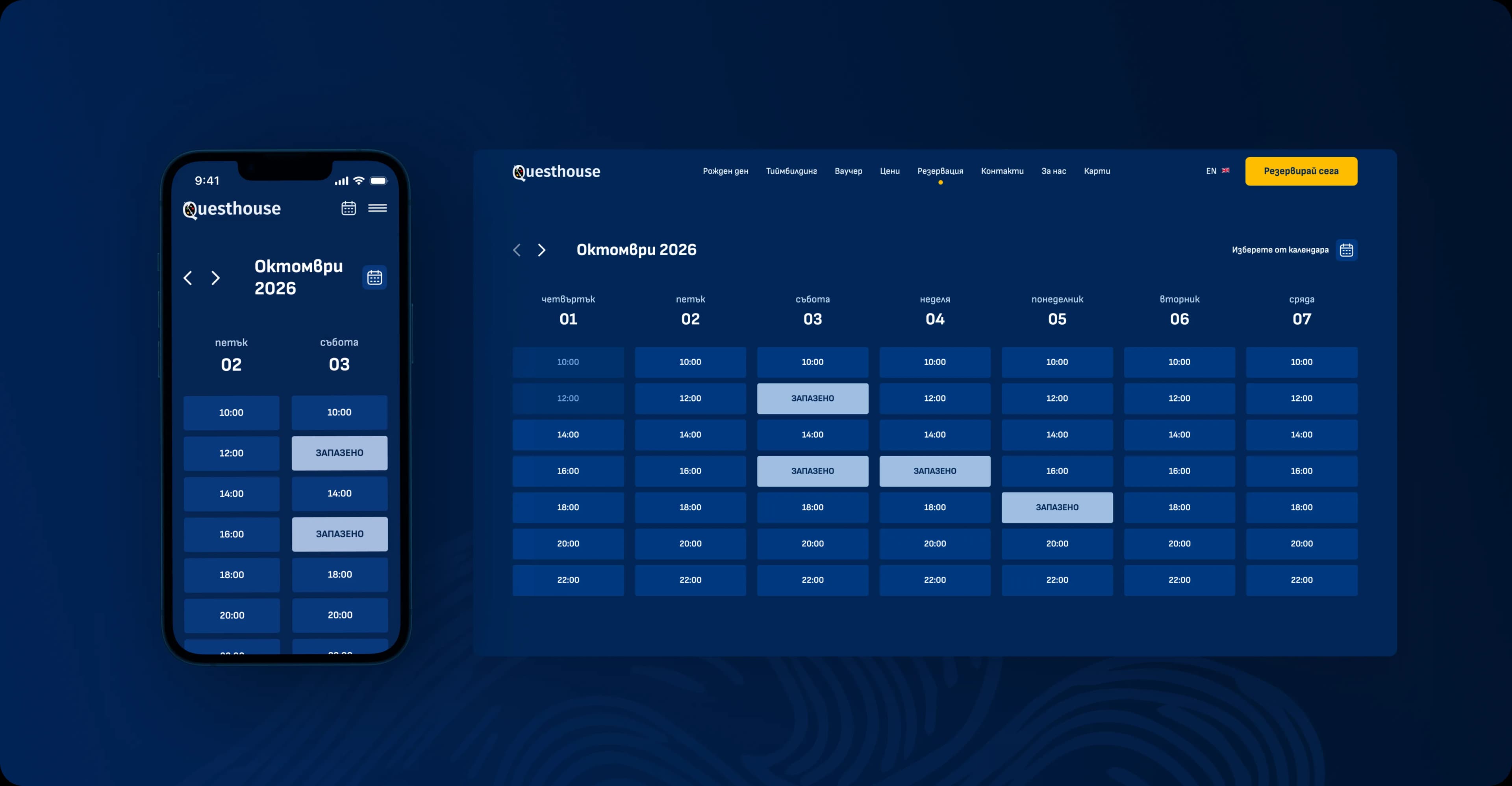
A week does not fit in a phone, so we did not cram it in
On a large screen the calendar shows a week. On a phone the same table becomes unreadable, so we rearranged it: two days side by side, hours sized for a thumb and not a single row that drags sideways.
The arrows and the calendar stay at the top, so a date is one tap away. The form opens under the chosen hour, on the same screen, because the decision is made on the move.

The painting leads, the interface steps back
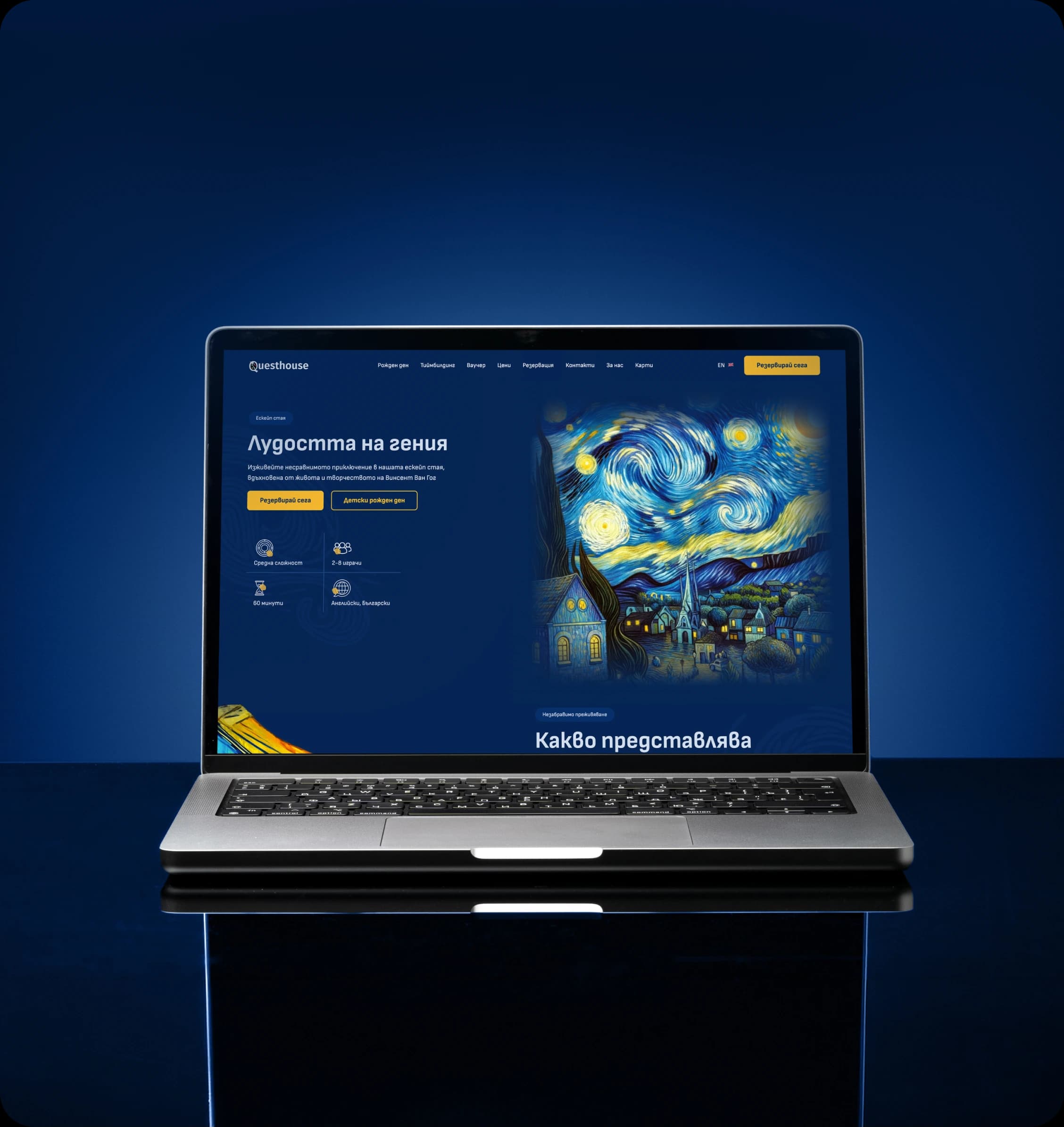
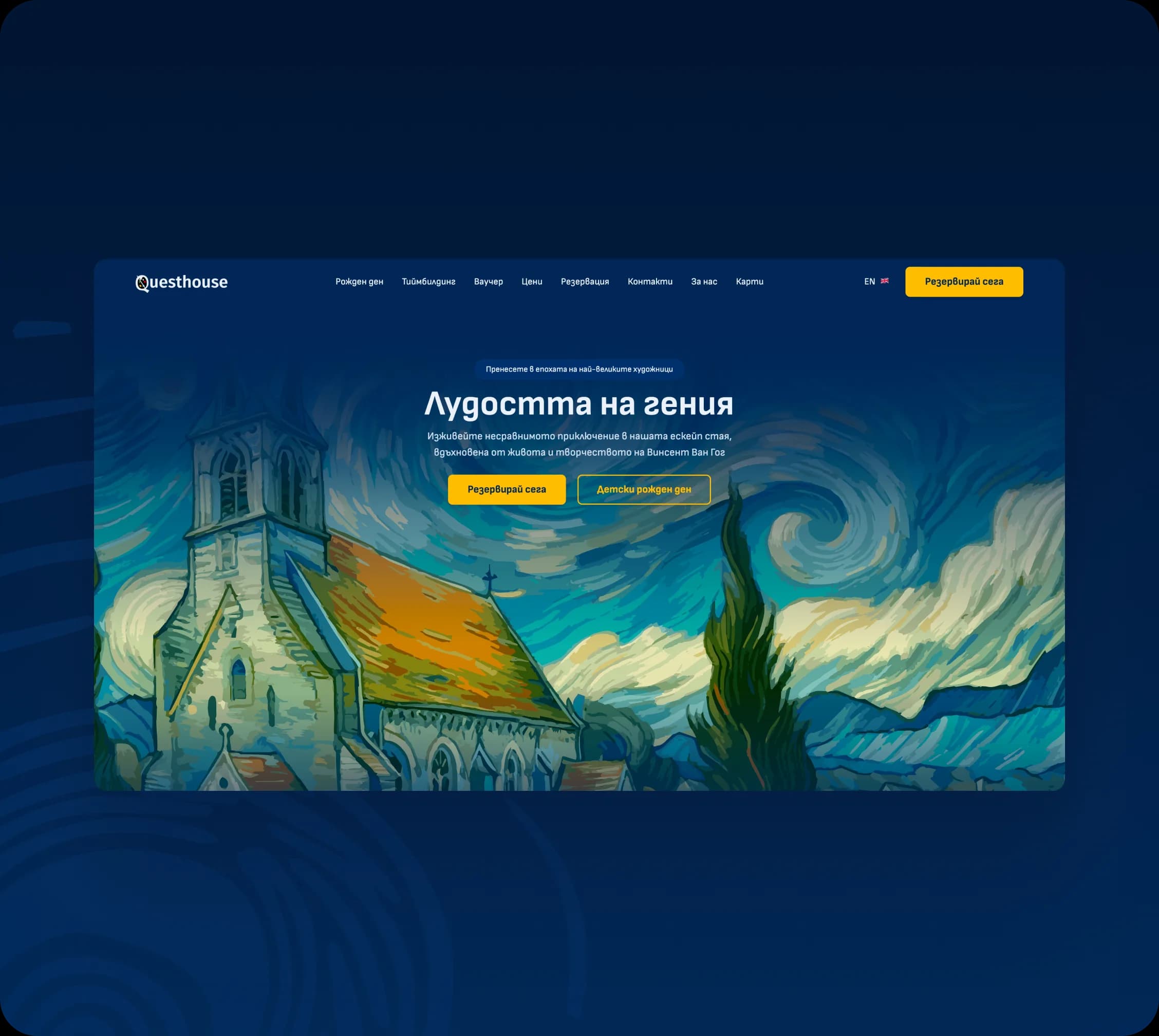
The whole site sits on deep blue, so the colour stays where it belongs: in the Van Gogh paintings. The typography keeps quiet, and yellow is held back for one thing, the booking button, which sits in the same place on every screen.
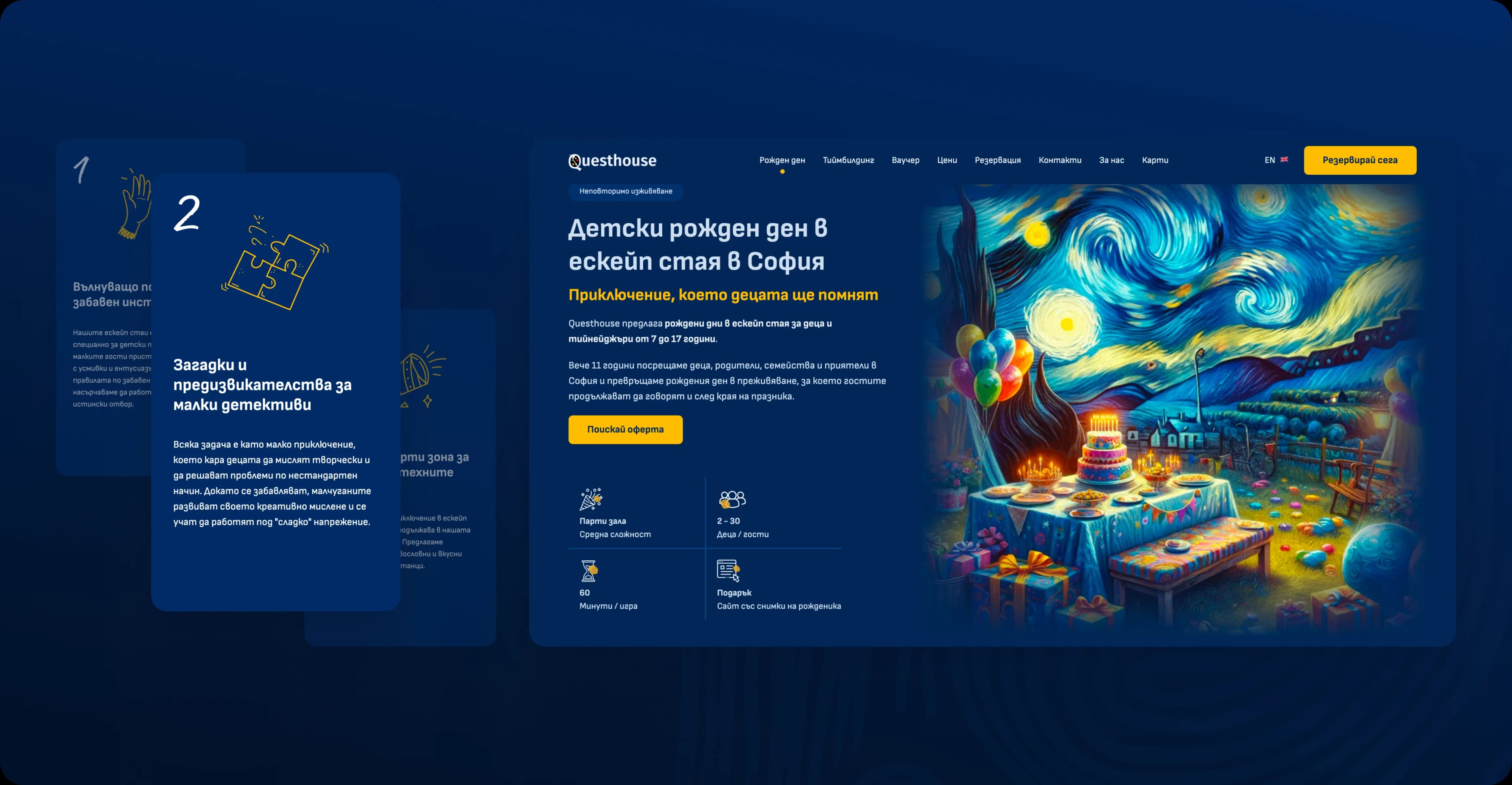
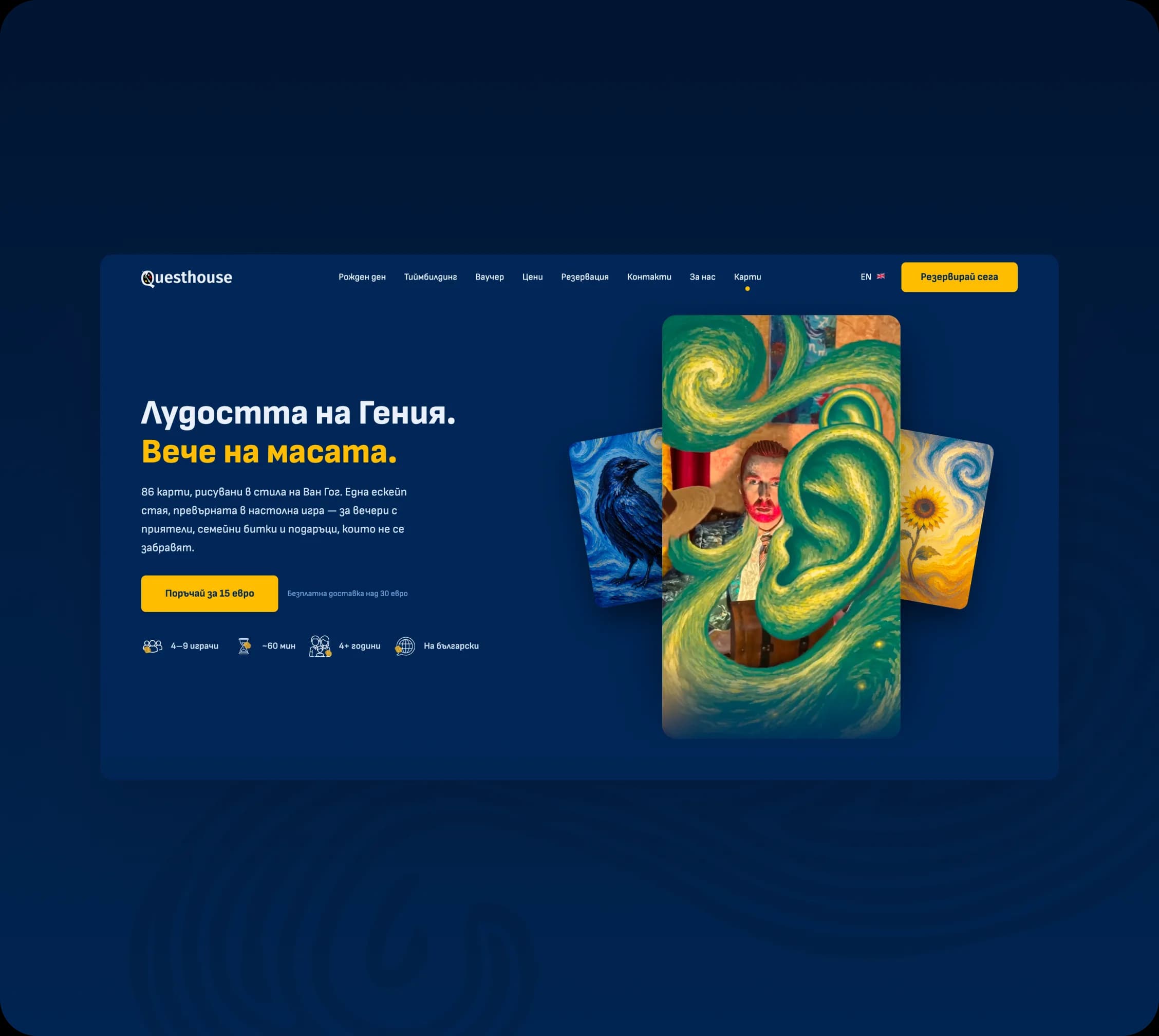
The occasions sit on top of that ground. A birthday, a team building, a voucher and the 86-card board game each get their own page, built to the same structure, so a person finds their way from the first screen on, whichever one they land on.
See it live
The project is online and running. Open it and see how it holds up in the real world, not just in screenshots.
Open the site · questhouse.bg · Open the site · questhouse.bg ·
Open the site · questhouse.bg · Open the site · questhouse.bg ·
Work