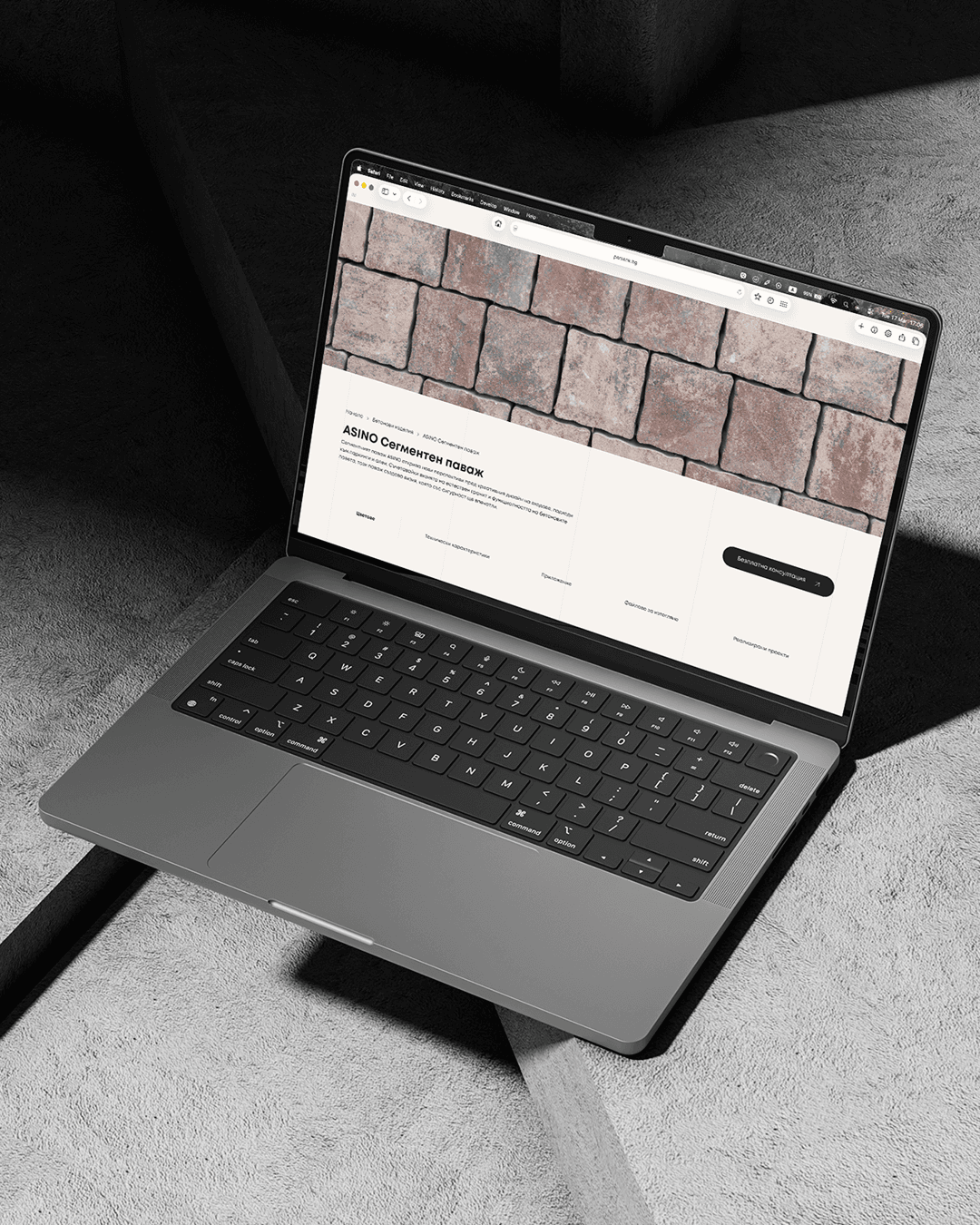
The redesign of Persenk's website created a new digital identity for a brand established in pavements and concrete solutions. We built not just an updated site, but a clear, functional, and compelling digital experience that showcases products and simplifies decision-making.
How did we help::
- UX/UI
- Development
- Web Experience
Client
Industry
Persenk is an established brand in the production of pavements and concrete surfaces, offering a wide range of solutions for outdoor spaces — from private projects to large infrastructure developments. The main challenge was to structure the rich portfolio in a way that's easy to navigate and drives action.
Through the redesign, we created a clear and logical UX structure that simplifies navigation between products, applications, and technical information. The visual language was refined and consistent, focused on real-world applications and material quality.
faster product discovery
growth in website inquiries
reduction in bounce rate
longer average time on site
Persenk had an impressive product portfolio, but the old site failed to present it accessibly. Users got lost in categories and rarely reached the technical information they needed.
Product categories were confusing and didn't logically lead to specific solutions.
The visual identity didn't reflect the quality and professionalism of the brand.
Products were shown without real-world applications — making it hard for clients to envision the final result.
A large portion of visits came from mobile devices, but the experience was far from optimal.
We focused on an organised product architecture, visual storytelling through real-world applications, and a modern, clean design that inspires trust.
Logical organisation by product type and application, with filters and quick access to technical documentation.
Products are presented in real settings — gardens, pathways, public spaces — to inspire and simplify the choice.
Designed for mobile devices from the start, with fast navigation and optimised imagery.
Every product page guides towards a specific action — inquiry, spec download, or connecting with a consultant.
We began with an audit of the existing site, the competitive landscape, and user behaviour. We mapped the main user journeys — from searching for a specific product to submitting an inquiry — and identified the key friction points and drop-offs.
Users search for specific solutions (pavement tiles, garden surfaces), not abstract product categories.
Visual context is decisive — real project photos increase trust and time on site.
Technical information (dimensions, load capacity, installation method) is critical for professional clients.

"I want to see how the pavement will look in my yard before I order it. Catalogue photos aren't enough."
Problems
- Can't visualise the final result from a product photo alone
- Confused by the many sizes and colour variations
- Hard to compare products across different categories
- Doesn't know which surface type suits her specific conditions
Goals
- Find inspiration from real projects similar to hers
- Easily compare options and choose the right product
- Get clear information about installation and maintenance
- Quickly submit an inquiry with the selected product
Maria Koleva
Personal Info

"I need quick access to technical documentation and specs — I don't have time to dig through catalogues."
Problems
- Wastes time searching for technical specs and PDF documents
- The old site's navigation isn't organised for professionals
- Missing info on load capacity and installation conditions
- Hard to communicate specific products to clients and contractors
Goals
- Quick access to technical specs and drawings
- Easy sharing of product pages with clients
- Compare solutions by application and load capacity
- Download specifications directly from the product page
Georgi Todorov
Personal Info
From structure to vision
The wireframe stage allowed us to test and validate the information architecture before the visual design. We focused on user journeys — from the homepage to a specific product and inquiry.
Each page was designed with a clear content hierarchy, optimised for quick scanning and intuitive navigation on both desktop and mobile devices.
Work