We built a modern and intuitive website that streamlines the ordering process while staying true to the brand's identity.
How did we help::
- UX Research
- UX Design
- Front-End Development
- E-commerce
Client
Industry
Ikigai is a Japanese restaurant specialising in fast, easy and delicious traditional and modern Asian cuisine. Its mission is to deliver happiness through authentic Japanese food, inspired by the philosophy of 'ikigai' - a reason to live and wake up with a smile.
The Ikigai website redesign shortened the user journey and modernised the interface, resulting in increased user loyalty and brand recognition.
Reduction in registration wait time through improved interface
Growth in online orders thanks to the interactive grid
Growth in mobile website visits thanks to the responsive design
Faster table reservations through clear CTA elements
Despite its strong physical presence, Ikigai struggled to gain an edge online. The slow and difficult ordering process was turning potential customers into passive users.
A complex registration process with unnecessary steps taking around 1 minute and 42 seconds.
The old website design failed to attract new visitors.
The ordering user path was not clear enough.
The non-responsive mobile version did not support on-the-go ordering.
By shortening the waiting period, user engagement increases, stimulating interest.
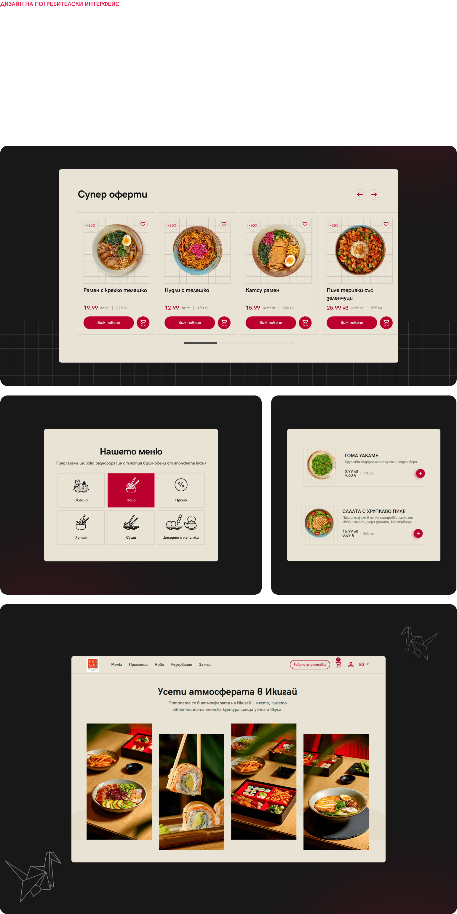
Improving user satisfaction through detailed visual design execution.
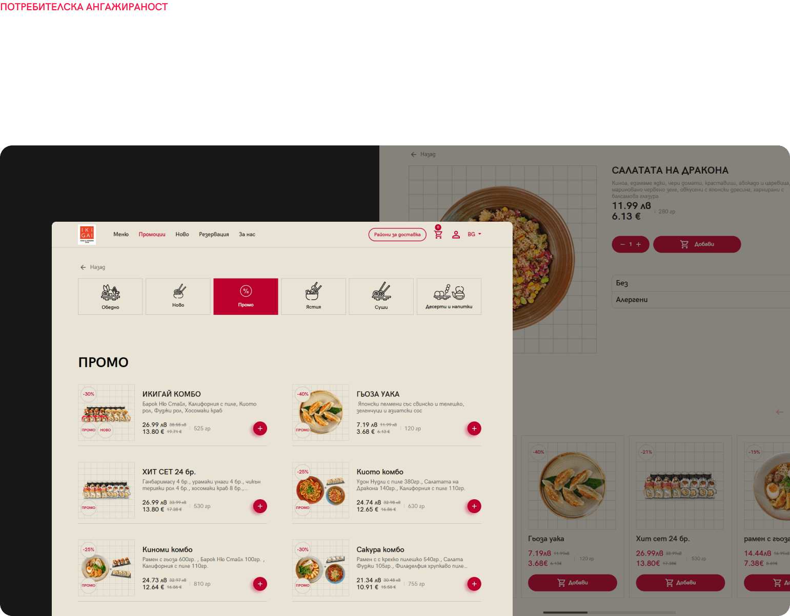
Prominent CTA buttons turn casual visitors into regular buyers.
Interface optimisation creates a functional experience regardless of device size.
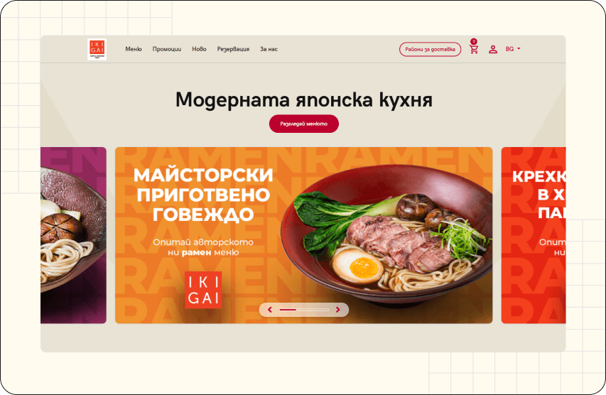
Following in-depth analysis of the competitive landscape and business niche, we positioned Ikigai strategically to reach success without compromising its identity.
The registration process is complex and insufficiently fast, which increases the website's bounce rate. A more modern interface and clearer user journey are needed.
Two users explain their problems and expectations to guide us in optimizing the design and functionality of the site.


We researched visual content that would guide users while recreating the unique taste and style of the brand.
Nothing excessive. Nothing hidden. The architecture we built is structured to lead forward - with clarity, logic and direction.
An organised, categorised structure that guides without overcomplicating choices. We crafted a visual framework to recreate Japanese aesthetics - clean lines, balance, attention to detail.
We analysed various interfaces until we found the perfect formula - adaptive design, personalised experience for every user, and universal compatibility across all browsers.
The wireframes served as a solid foundation for the visual design and development, minimising the risk of confusion or rework at a later stage.
The detailed analysis behind their creation was essential to achieving the final result - a clear user journey and engaging design.
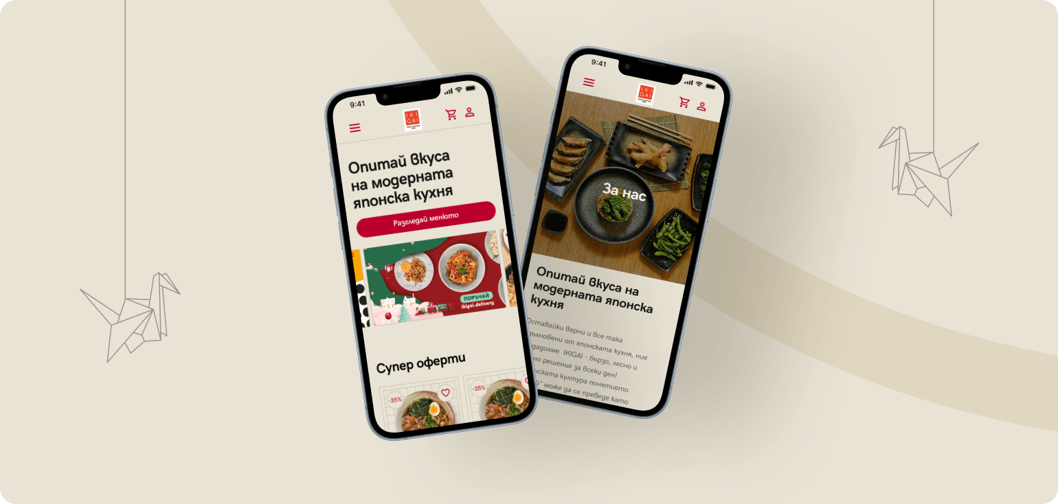
The intuitive design works seamlessly on any device size without compromising the user experience. Adaptive elements attract users while maximally reducing the site's bounce rate.
Clearly visible and thumb-friendly buttons, even on smaller devices.
Minimalist and convenient contact and order forms with auto-fill and visual error indicators
Fast, beautiful and seamless communication between the user and Japanese culinary culture
Loads fast and reads easily on mobile screens - with clear headings, adapted images and intuitive scrolling.
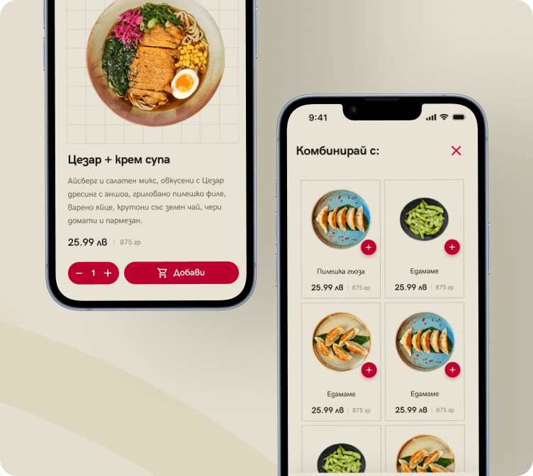
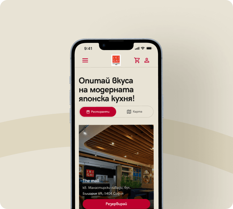
By creating a fast website, easy navigation and visually appealing images, we built a site that inspires.
See it live
The project is online and running. Open it and see how it holds up in the real world, not just in screenshots.
Open the site · ikigai.delivery · Open the site · ikigai.delivery ·
Open the site · ikigai.delivery · Open the site · ikigai.delivery ·
Work