A boutique store for eco and wooden toys, built around a curated selection, premium gifting and a cause behind every purchase.
How did we help::
- UX/UI
- Development
- E-commerce
- Shopify
Client
Industry
SweetBaby.bg is a new brand in a niche where parents choose slowly and buy on trust. The mission is to deliver not just a boutique feel, but an ecological choice.
Instead of thousands of products, the store relies on a short selection, clear age groups and the same treatment for every order: free shipping and a gift box.
curated items in the catalogue
European toy brands
age groups: 0-12, 12-24 and 24-36 months
donated from every order to causes for children
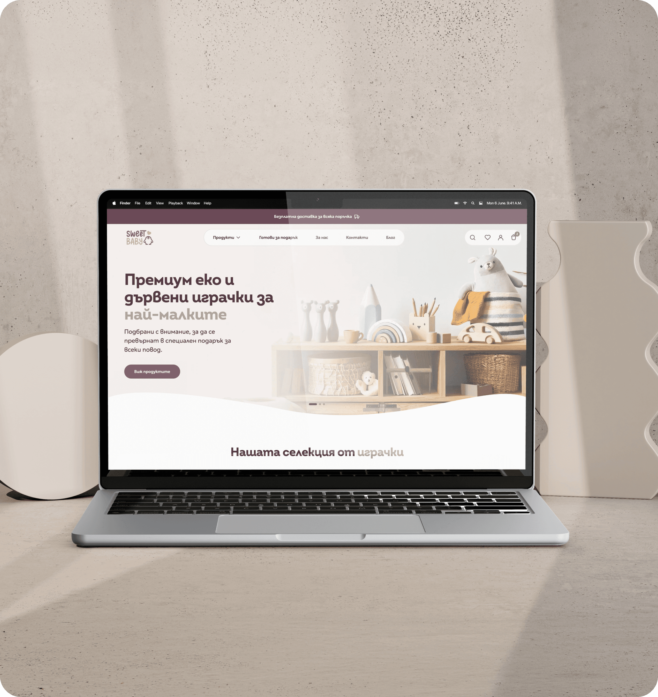
We built a clean interface where the toy photography leads and everything else serves a quick, calm decision to buy.
The theme was built for the brand rather than bought off the shelf, which gives control over every section, the typography and the loading speed.
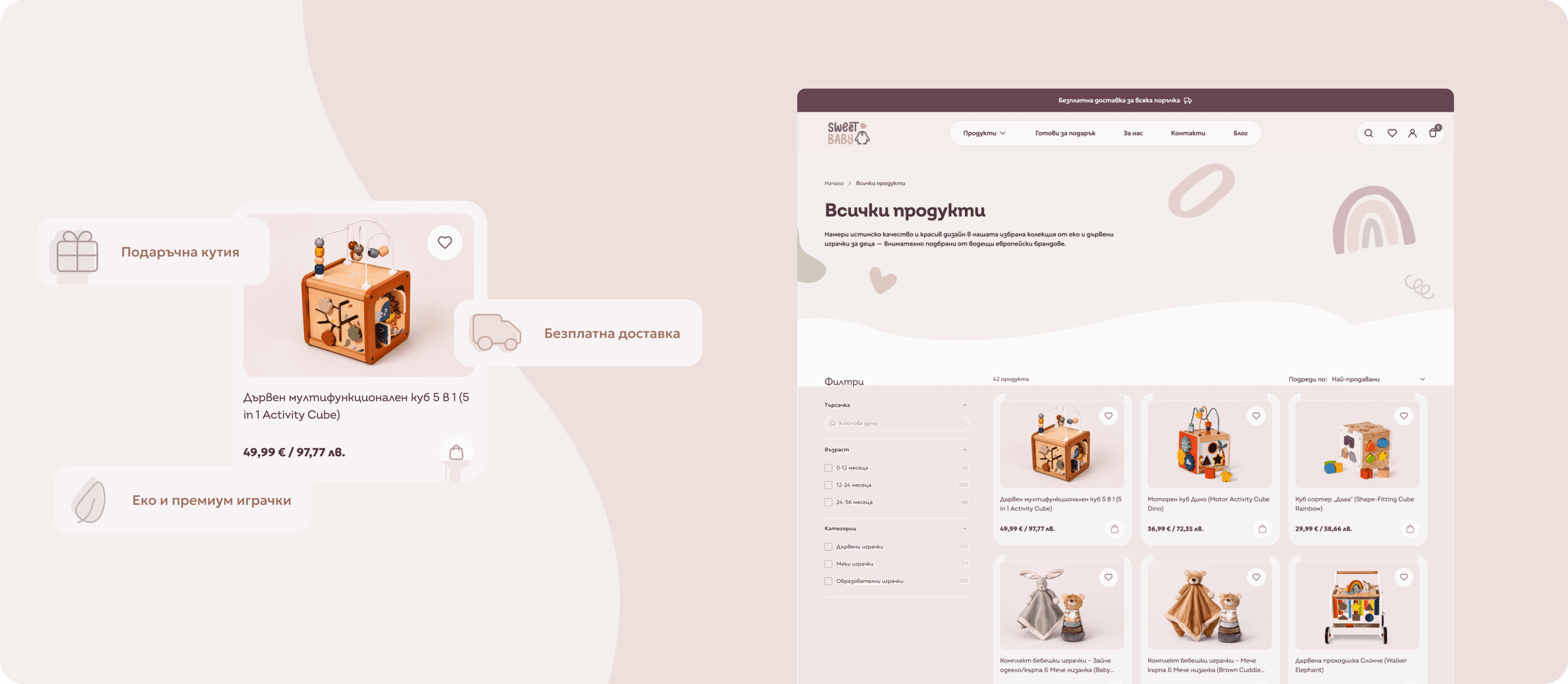
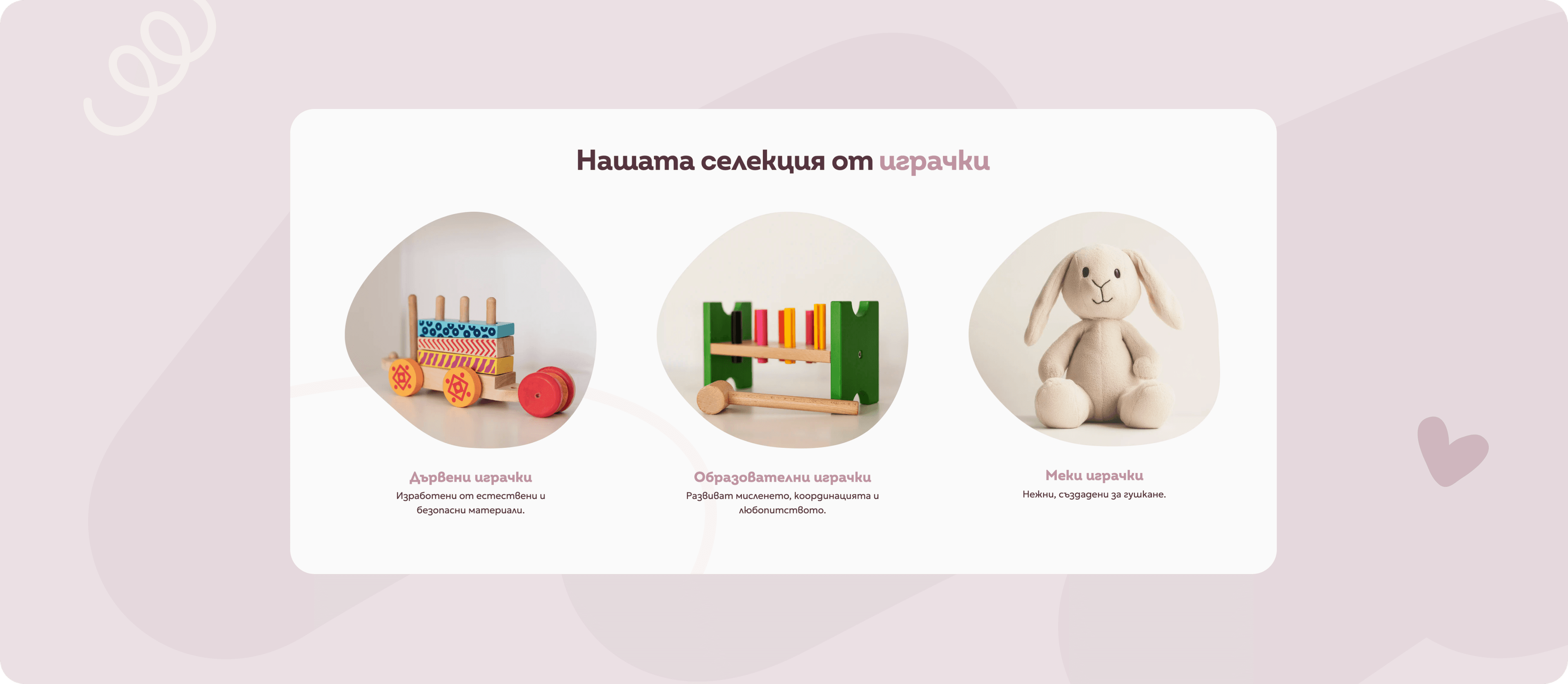
The catalogue is organised into three age groups and three categories, so a parent reaches the right toy in two clicks.
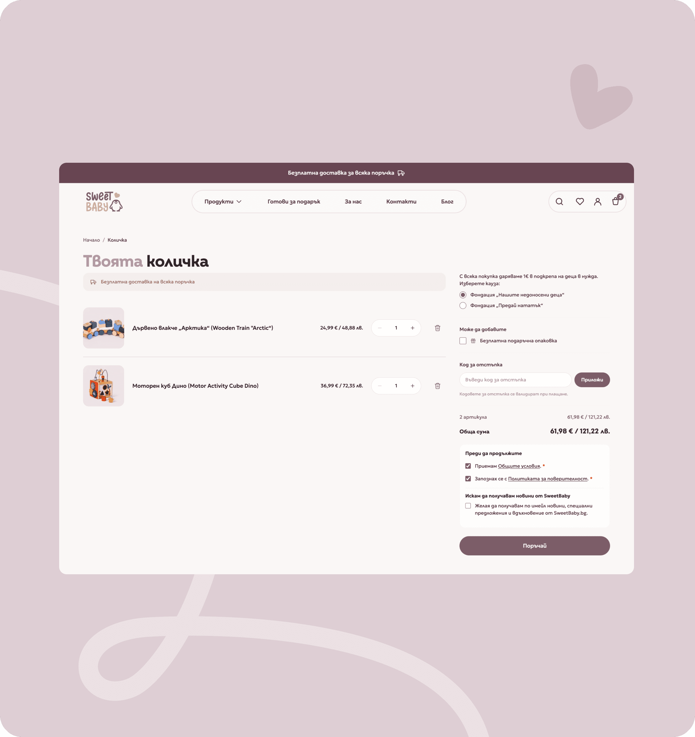
Predictive search shows results as you type and the cart opens as a side drawer, so a parent never leaves the page they are on.
The "Ready to gift" collection, the gift box and the 1 euro donation stay visible from the home page to the cart instead of hiding on a separate page.
We looked at who sits on the other side of the screen. It is not only the parent, but also a relative looking for a ready gift, and the two expect different things from the store.
Parents read the material and the age range long before they reach the price. A large share of orders are gifts, placed by relatives rather than the parents themselves. And the cause tips the decision when two products look equally good.

Victoria
Personal info
I want a toy I can relax about when the baby puts it in their mouth.
Problems
- It is hard to find where the toy was made and what it is made of.
- Age labels differ from site to site and end up confusing.
- Large stores list thousands of items and choosing takes hours.
- She is unsure whether the paint and finish are safe for a baby.
Goals
- Buy a toy that suits the exact age of her child.
- See the material, the dimensions and the origin clearly.
- Decide quickly, without comparing ten websites.
- Support a brand that shares her values.

Martin
Personal info
My nephew is six months old. I have no idea what you give a baby that age.
Problems
- His nephew is six months old and he has no idea which toy is right.
- Age labels on other sites mean nothing to him.
- He is afraid of giving something unsafe for such a small child.
- Wrapping takes time and the gift is needed today.
Goals
- Find a toy that is certain to suit a six month old.
- See clearly what it is made of and whether it is safe for a baby.
- Receive a ready box with a card and no extra work.
- Order online and have it arrive in time for the event.
The structure that shaped the path to purchase
The wireframes mapped the logic behind every step of the customer journey: the home page, the age filter, the product page, the cart and the checkout. They allowed us to order the content, prioritise the key actions and clean up the navigation long before we reached colour and visual detail.
At this stage we validated both buyer profiles, the parent searching by age and material, and the relative buying a gift. The wireframes showed that the gifting experience and the cause had to be present at the start of the journey rather than as a final step in checkout, and that determined the structure of the home page.
Shopify brings certified payment infrastructure out of the box: encrypted data, PCI compliance and the wallets a customer already uses. Our job was not to rebuild it, but to place it inside a single screen shaped for the brand.
That is why the cart, the delivery details and the payment sit together on the page, while choosing an Econt or Speedy office and applying a promo code happen in place, without the customer losing context.
Payments run through the Shopify checkout infrastructure, so customer data is encrypted and compliant by default, with no custom implementation of our own.
Apple Pay, Google Pay and Shop Pay are available immediately and save typing, sitting next to card payment and cash on delivery for the more conservative buyer.
On top of the platform we added an Econt and Speedy office picker searchable by location, which Shopify does not cover for the Bulgarian market.
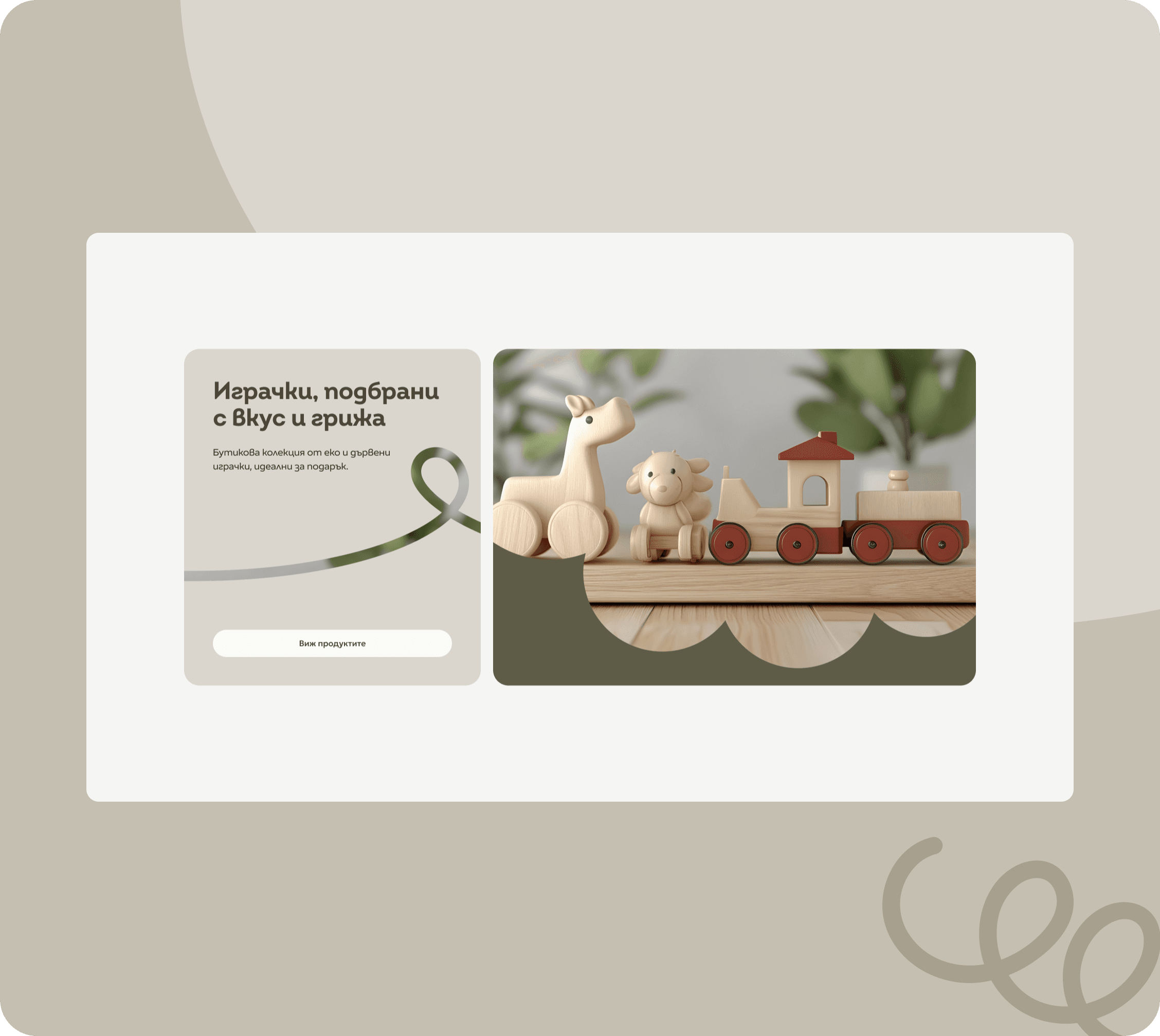
The theme was built from scratch for SweetBaby.bg rather than adapted from a ready made template. That allowed a light, calm interface with plenty of air, where product photography leads and the typography around it stays quiet.
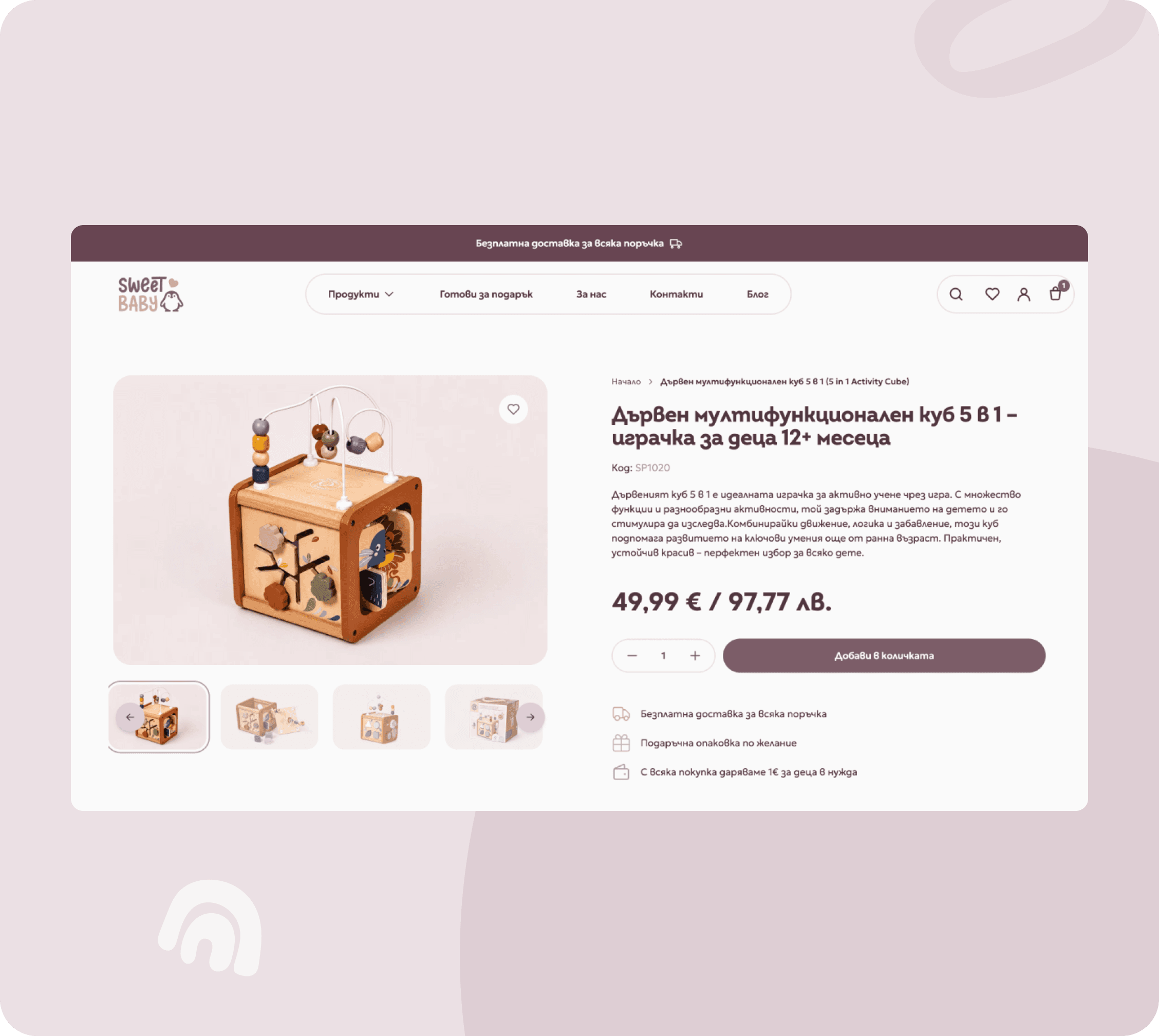
The working parts sit on top of that design: product pages with material, age and dimensions, a wishlist, predictive search and a blog that brings content and visibility in search engines.
See it live
The project is online and running. Open it and see how it holds up in the real world, not just in screenshots.
Open the site · sweetbaby.bg · Open the site · sweetbaby.bg ·
Open the site · sweetbaby.bg · Open the site · sweetbaby.bg ·
Work