The redesign of eDrogeria's website created a new digital identity for a brand established in online medical and health product retail. We built not just an e-commerce store, but a clear and convenient digital experience that simplifies choices and builds trust.
How did we help::
- UX/UI
- Development
- E-commerce
Client
Industry
eDrogeria is an established online store offering a wide range of health products, supplements, and cosmetics aimed at everyday care and prevention. The main challenge was to structure the large variety of categories and products in a way that's easy to navigate and leads to quick decision-making.
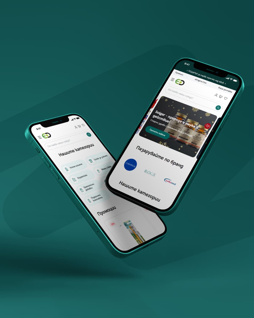
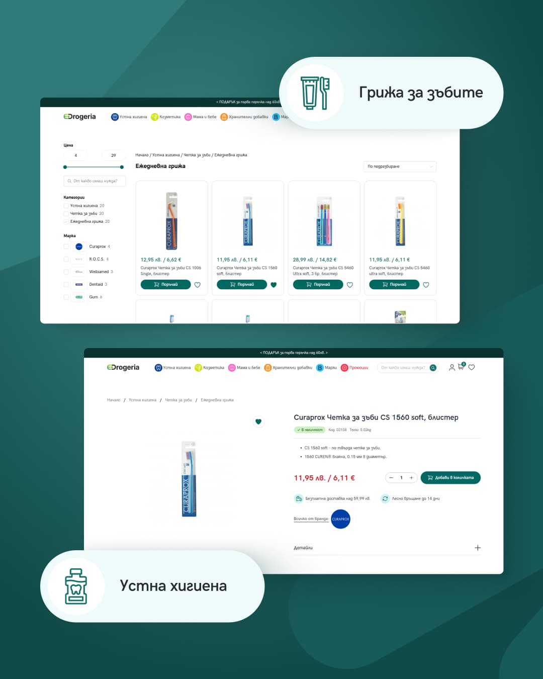
Through the redesign, we created a clear and logical UX structure that simplifies product discovery, filtering, and order completion. The visual language was built around a clean and functional aesthetic — with clearly differentiated product cards, highlights on key information like price, availability, and promotions, and an interface that puts content and action front and centre.
faster product discovery
growth in completed orders
reduction in abandoned carts
longer average time on site
eDrogeria had a rich assortment of health products, but the old site failed to present them in an understandable way. Users got lost in categories and rarely completed an order.
Dozens of categories and subcategories with no clear logic — users didn't know where to start.
The interface didn't inspire trust — a critical factor when buying health products online.
No way to quickly narrow results by brand, price, or purpose.
Too many steps to complete an order, leading to a high rate of abandoned carts.
We focused on intuitive product navigation, transparent information, and a modern design that builds trust from the first glance.
Logical organisation by health category and purpose, with smart filters for quickly finding the right product.
Each card shows price, availability, promotions, and ratings at a glance — no extra clicks needed.
We reduced steps to a minimum, added guest checkout, and clear progress indicators.
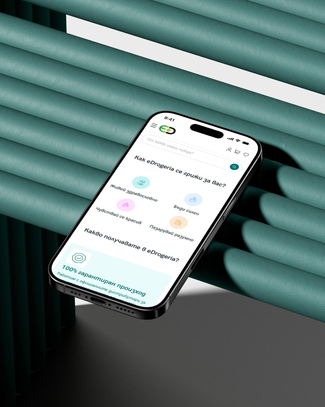
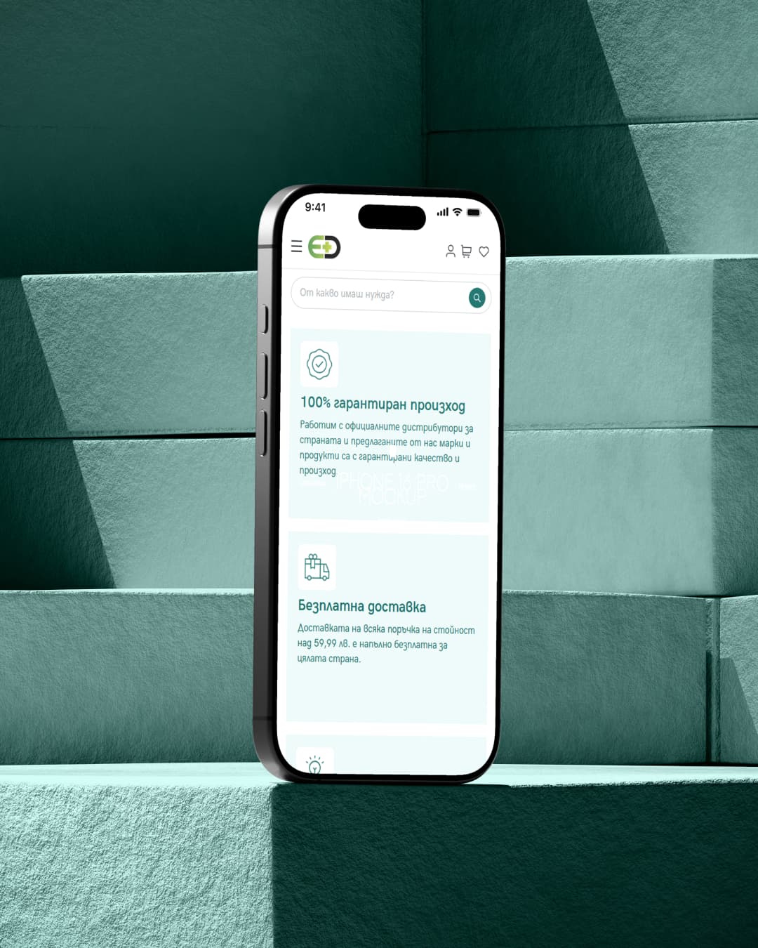
Over 70% of users shop from their phone — we optimised every element for the mobile experience.
We started by analysing user behaviour, the competitive landscape, and the most common reasons for order abandonment. We traced the journey from product search to purchase completion and identified the main friction points.
Users search by specific symptom or need ("immune vitamins", "dry skin cream"), not by brand or category.
Trust is critical — users expect clear information about ingredients, origin, and expiry date.
Checkout speed is decisive — every extra step increases the abandoned cart rate.

"I want to quickly find the right vitamins for the kids without reading endless descriptions. Just show me what's suitable for their age."
Problems
- Can't filter products by child's age group
- Confused by too many brands and options with no clear comparison
- Doesn't trust unfamiliar online stores for health products
- Checkout takes too long with a toddler in hand
Goals
- Quickly find suitable products for a specific age and need
- Read reviews from other parents
- Shop securely and receive products fast
- Save favourite products for one-click reordering
Denitsa Ivanova
Personal Info

"I order supplies and products for my practice every week. I need a store where I can repeat an order in seconds."
Problems
- Wastes time searching for specialised products in the general catalogue
- No option for quick reorder of regular supplies
- No professional section with products for medical specialists
- Invoicing and bank transfers aren't convenient
Goals
- Quick access to professional products and supplies
- One-click reorder from order history
- Automatic invoice generation with every order
- Reliable and fast delivery to the practice
Dr. Petar Stoyanov
Personal Info
From user journeys to interface
The wireframe stage allowed us to validate the catalogue structure, user flows, and checkout process before the visual design. We tested different approaches to filtering and product organisation.
Each page was designed with a focus on navigation speed and information clarity — from the category page to the product card and order completion.
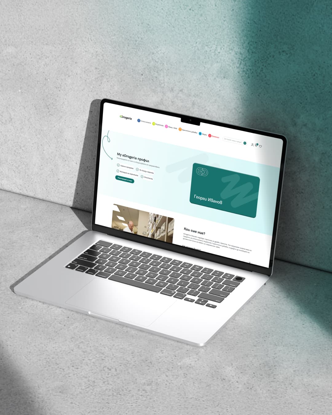
We built eDrogeria on WordPress and WooCommerce with a focus on fast, intuitive shopping. The interface features live search with instant results, product cards with clear pricing in BGN and EUR, and smart filters by category and brand.
The design is fully responsive with a mobile-first approach. Four main sections — Oral Hygiene, Cosmetics, Mother & Baby, and Nutritional Supplements — guide users to a quick and confident purchase.
Work