We crafted a digital journey that supports parents, simplifies planning, and brings HerBebe's mission of age-based nutrition to life.
How did we help::
- UX Research
- UI Design
- Front-End Development
- E-commerce
Client
Industry
HerBebe is a children's food brand with its own product line, age-specific meal plans, and a subscription-based model. Built for modern parents, the platform blends care, convenience, and digital simplicity.
We simplified the journey and matched HerBebe's care with digital clarity. Conversions rose, drop-offs fell, and trust grew stronger.
More parents committed to weekly meal plans after launch
Faster checkout - thanks to the custom calculator and simplified flows
Cart abandonment - fewer users dropped off during the ordering process
Mobile engagements - more users browsing via phone
HerBebe had a clear vision - offering thoughtful, personalized meals for children - but its digital experience didn't reflect that care. The platform felt outdated, confusing, and incomplete.
Users often got lost or frustrated trying to complete basic actions.
The steps to order or subscribe weren't obvious or intuitive.
Descriptions were sparse, and the lack of visuals made products harder to trust.
Key features like daily menus and filtering by age weren't well integrated.
Designing an experience that feels simple, smart, and reliable
To elevate HerBebe's digital presence, we focused on clarity, personalization, and a frictionless journey - from discovering meals to completing a subscription.
We analyzed competitor platforms and mapped user behaviors to identify where confusion occurred and which moments were most critical to earning trust.
We restructured the journey into clear, guided steps - removing guesswork and making the website feel fast, logical, and manageable.
We introduced an interactive calculator that adjusts pricing in real-time based on age, meal plan, and delivery frequency.
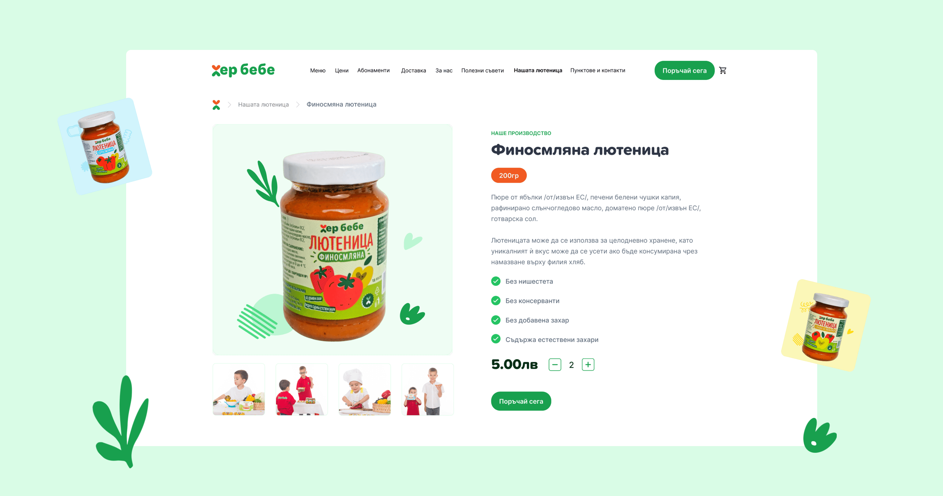
We crafted a layout where product information, daily menus, and benefits are front and center, helping users make informed choices without digging through hidden pages.

Creating a user-centered experience
Redesigning HerBebe wasn't just a new website - we built a complete platform that guides the user smoothly and logically from choosing food to completing an order. Every detail, from the daily menu to subscriptions, is structured to be easy, intuitive, and helpful.
At the core of the process were the real needs and behavior of users. Through competitor analysis, UX testing, and research, we cleared up the navigation, content, and steps. The result is a digital experience that reflects HerBebe's care - predictable, pleasant, and thoughtful.

"I care about what my child eats, but I don't have time to compare ingredients and plan a menu every day. If the site is complicated or looks outdated, I give up quickly."
Problems
- Difficult navigation confuses her and often leads to abandoned orders
- Lack of age-based filtering slows down her choice
- Unclear subscription options make her hesitate
- Outdated design and missing information reduce her trust in the brand
Goals
- To easily see the daily menu based on her child's age
- To order and manage subscriptions with minimal steps
- To clearly understand what each meal or plan includes
Elena Nikolova
Personal Information
Wireframing the journey - from question to confidence
Wireframes were central to shaping how parents would navigate HerBebe's offering - from understanding how the service works to choosing meals with confidence. These early-stage layouts helped us structure the core user flows, test content visibility, and prioritize what matters most on each screen.
We used them to validate the logic behind the age-based meal selection, the price calculator, and the subscription steps - ensuring clarity even before visuals came into play. The wireframes weren't just a planning tool; they helped us align user needs with business goals and build a smooth, trustworthy experience from the ground up.
A site that works in the palm of your hand
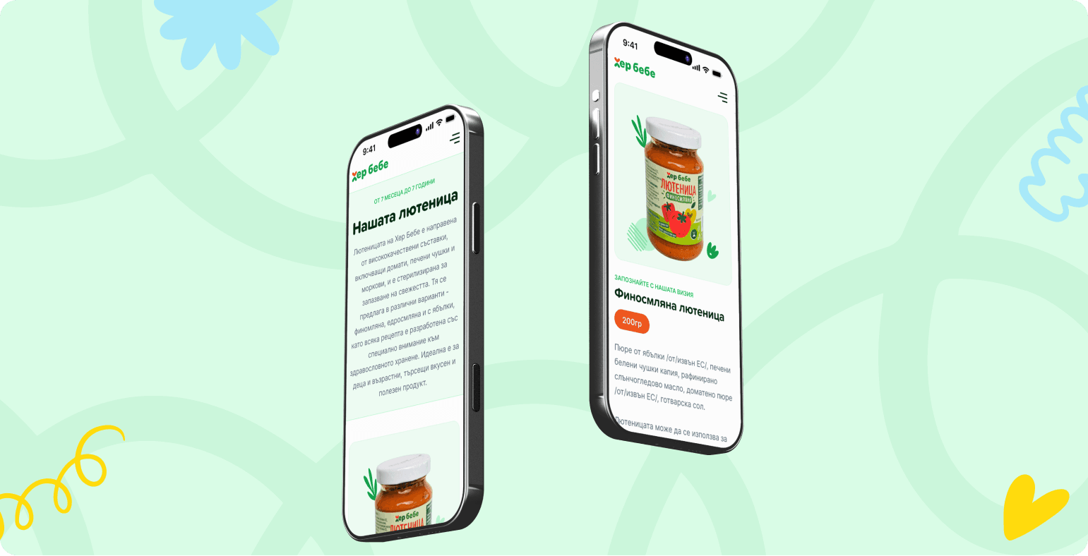
Our research revealed that most HerBebe users access the platform from their phones - often while multitasking. This insight made mobile optimization a top priority. We focused on creating a fast, focused experience that supports quick decisions and easy browsing, even in the middle of a hectic day.
Key sections like the daily menus and meal categories are always one tap away - no scrolling or searching required.
All interactive elements were resized and spaced for accurate tapping, creating a frictionless experience across devices.
We removed visual noise and restructured page layouts to ensure that key information appears where users expect it.
From selection to checkout, the entire process was simplified and compressed to fit seamlessly into small screens.
Filters adapt to screen size and user behavior, allowing efficient product browsing without slowing the experience down.


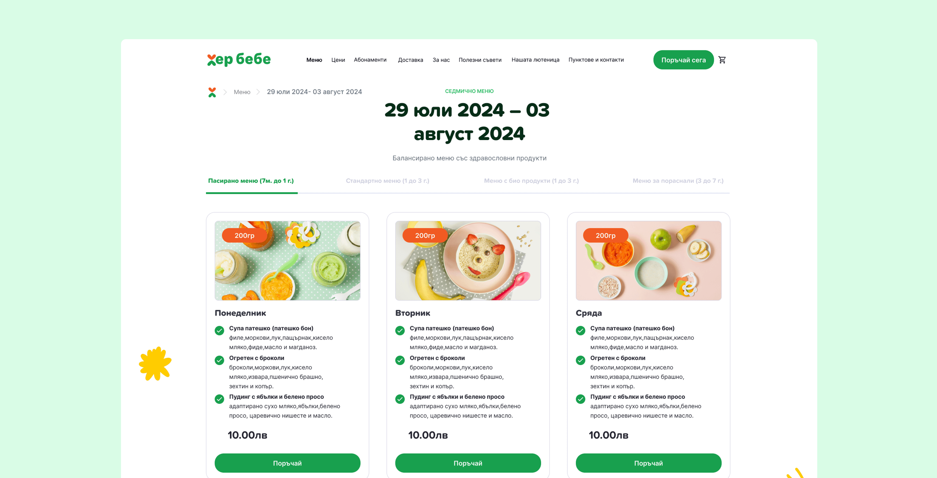
What's special today? Just a tap away
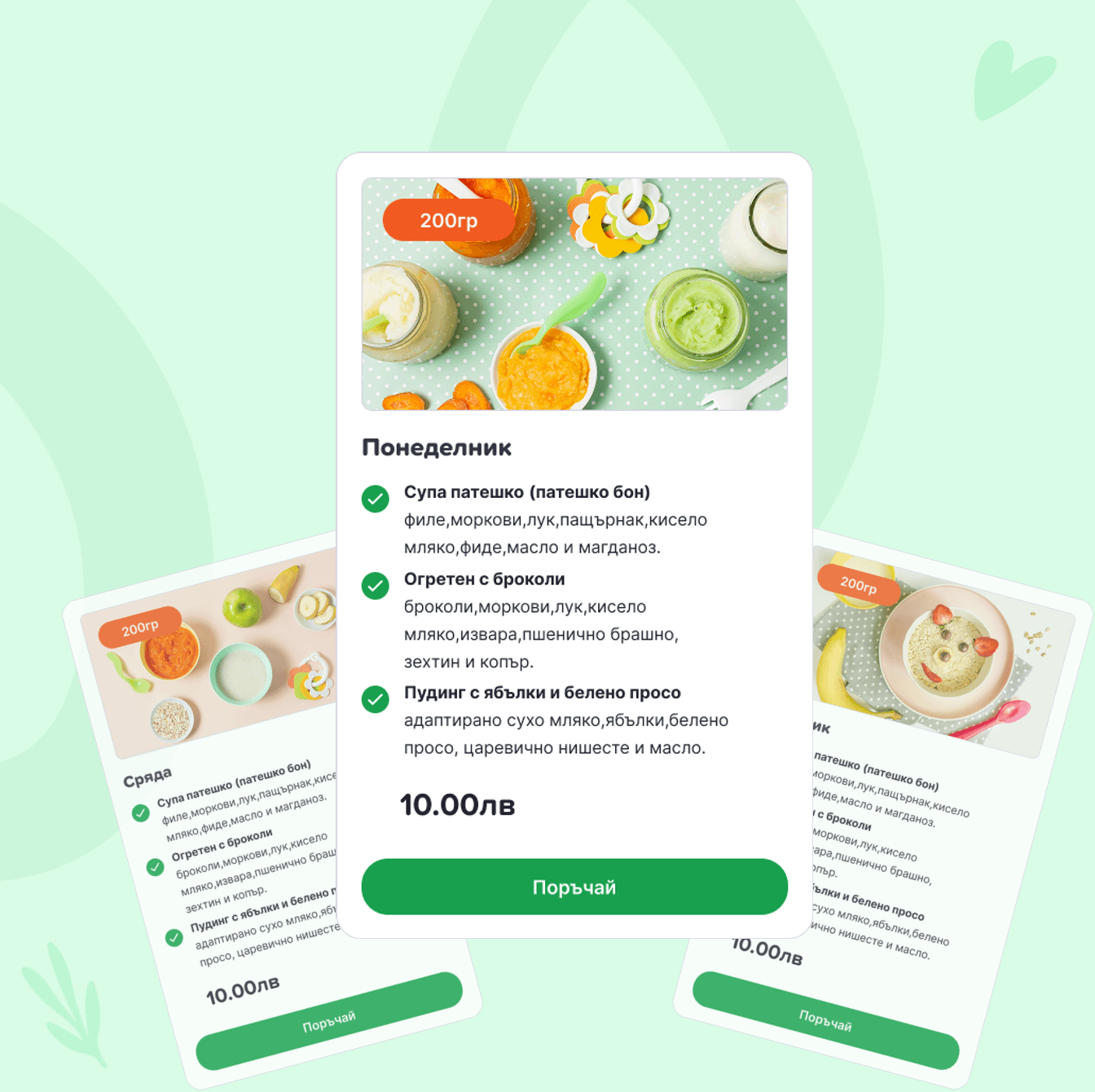
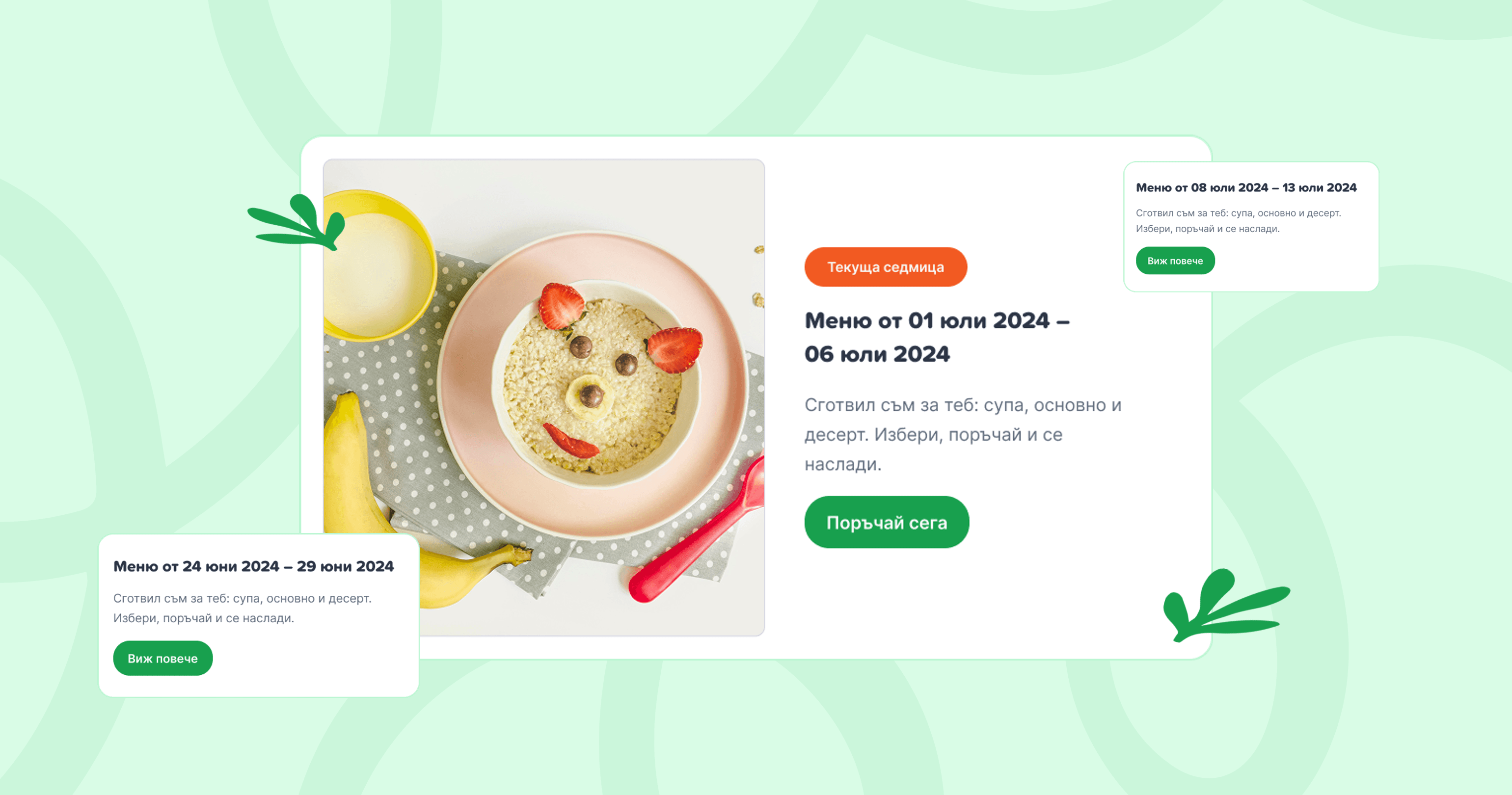
HerBebe offers fresh, curated meals every day - tailored to children's needs and age groups. To make this stand out, we gave the daily menu prominent placement, with clean visuals and smart navigation. Users can quickly explore what's new, see age-appropriate options, and take advantage of daily offers without friction.
The result is a seamless balance between inspiration and usability. We also ensured that recurring users could spot changes at a glance - highlighting today's meals with subtle labels and consistent layout. No unnecessary scrolling, no guessing. Just a clear, focused path from discovery to decision.
We also ensured that recurring users could spot changes at a glance — highlighting today's meals with subtle labels and consistent layout. No unnecessary scrolling, no guessing. Just a clear, focused path from discovery to decision.
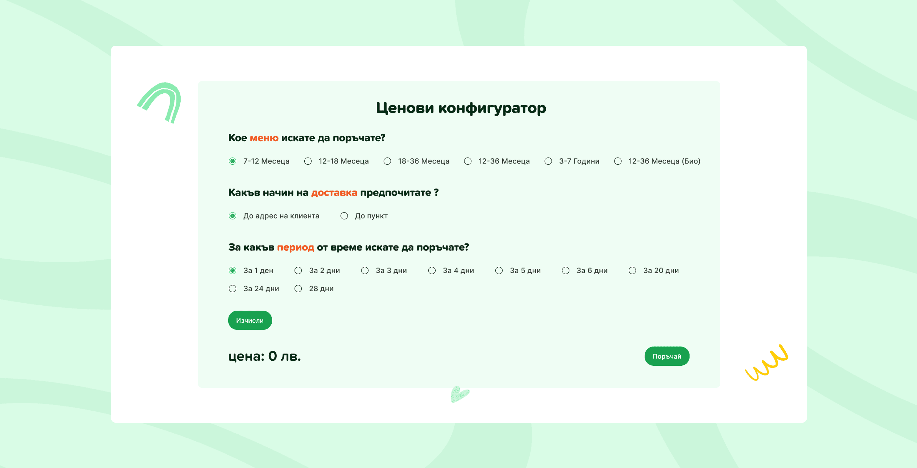
Clear pricing in just a few steps
We built a custom calculator that makes it easy to explore subscription options without confusion. Users simply select the child's age group, preferred plan, and number of meals - and instantly get an accurate price tailored to their needs. No need to dig through multiple pages or wonder about final costs. Everything is in one place, making decisions faster, clearer, and more transparent.
Our goal was clear: instead of digging through multiple pages, everything needed to make a decision is gathered in one place — fast, transparent, and without surprises.
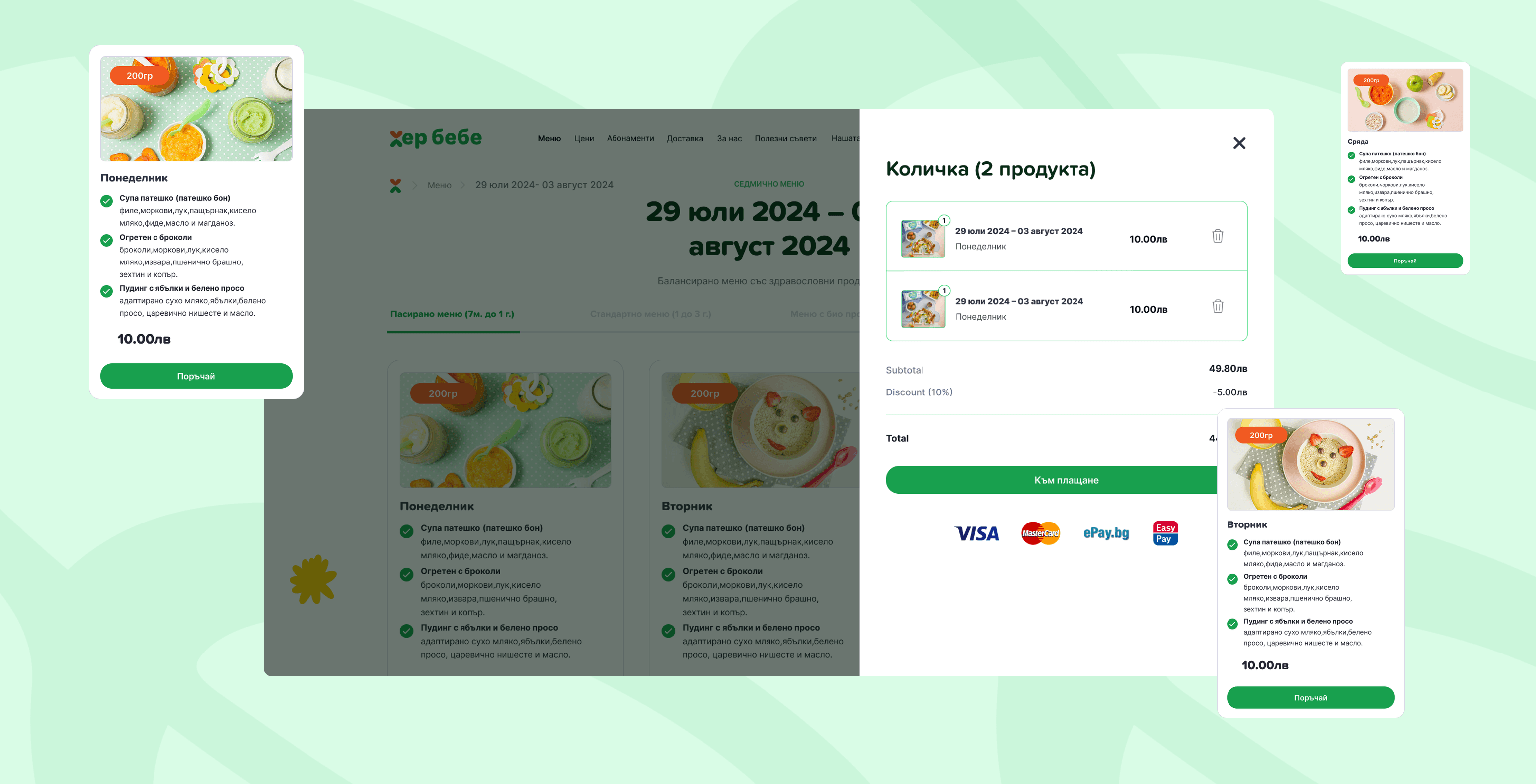
Making mealtime easy, from click to doorstep
We designed HerBebe's store to simplify decision-making for busy parents. Whether choosing meals by age group, calculating pricing, or subscribing, the process feels intuitive, fast, and stress-free. Every interaction is built around ease - so parents can spend less time ordering and more time caring.
Designing with care: an interface that supports real-life parenting
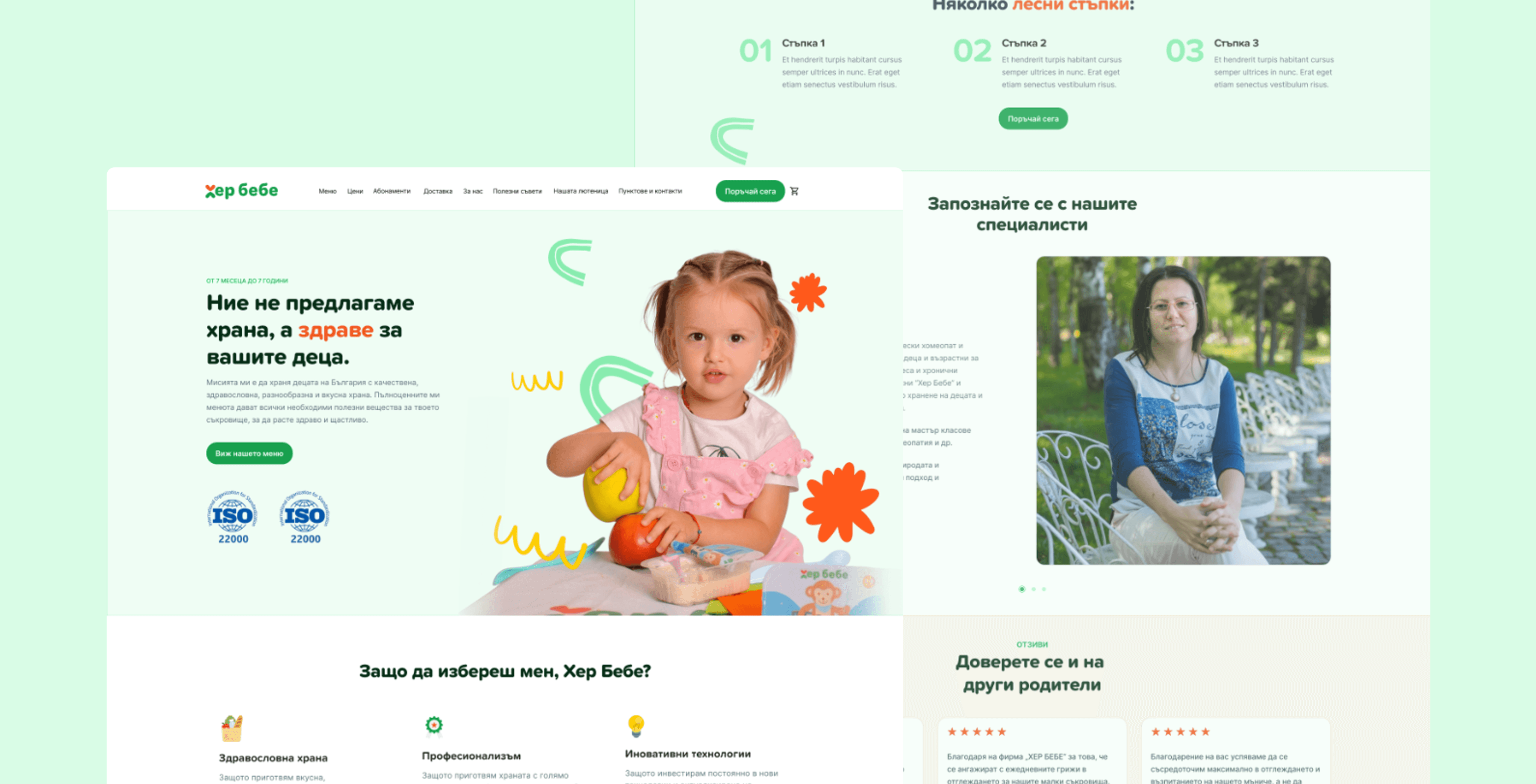
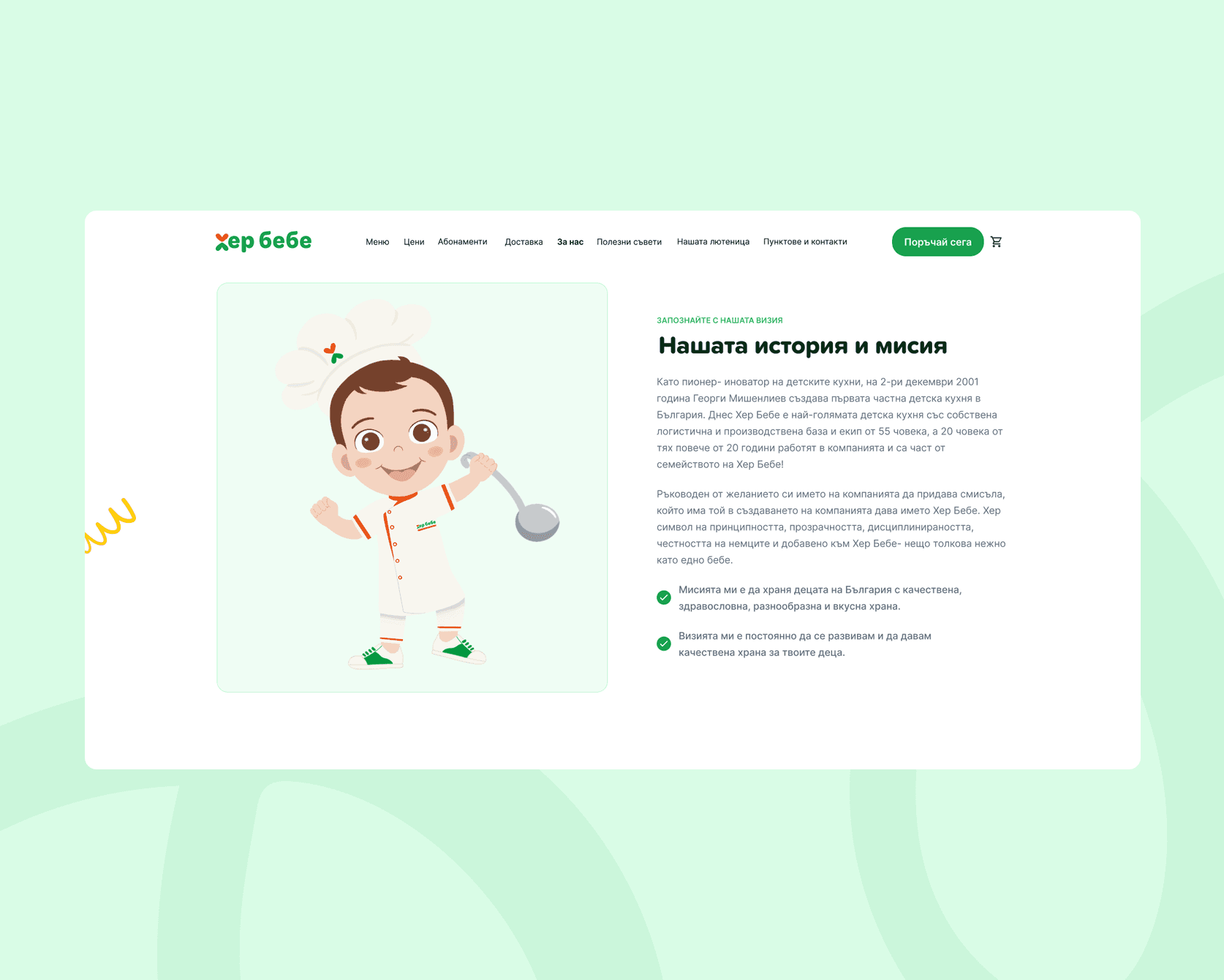
The UI for HerBebe had to reflect both the simplicity parents need and the trust they expect. We chose a warm, clear aesthetic with soft tones, friendly typefaces, and intuitive spacing - bringing calm and focus to a busy user's experience. Key actions like choosing age groups, browsing own-brand products, or adjusting the calculator were made highly accessible.
Visual hierarchy and mobile-first logic ensure parents can act quickly, whether shopping late at night or between tasks. The interface supports - not distracts - making the care behind the brand feel effortless. Every element serves a purpose, helping users focus on what matters most.
Work