
Emiliya Georgieva
28 Feb
4 mins read
- Copy link
The Significance of Color in UX/UI Design: Enhancing User Experience Through Visual Harmony
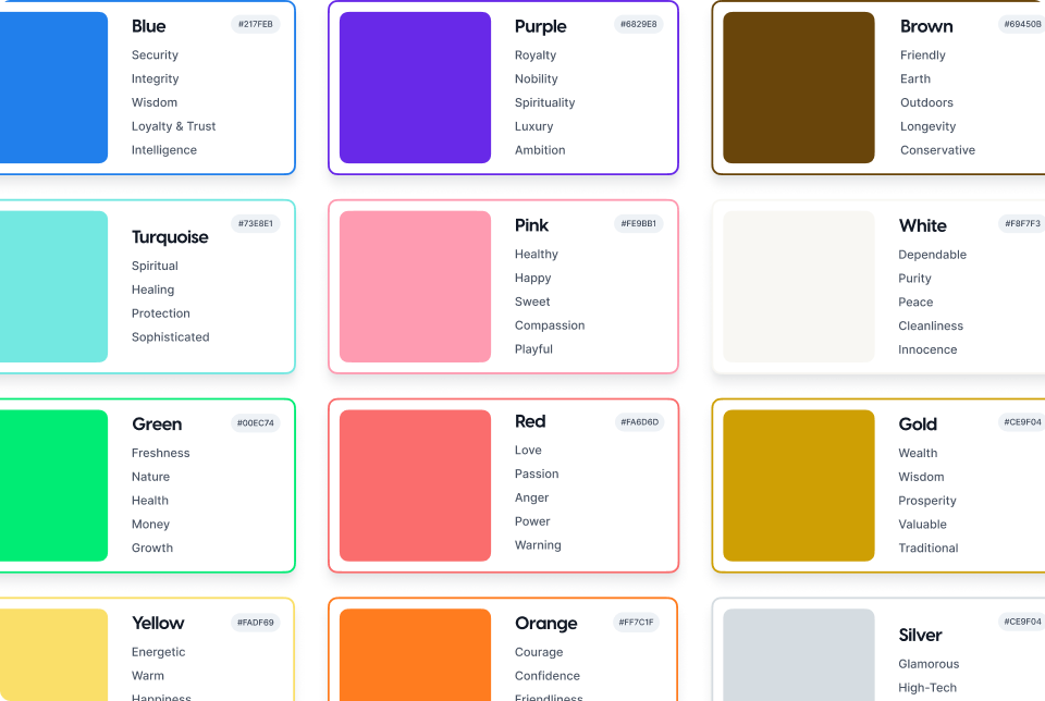
The Psychology of Color:
Color psychology delves into the impact of different hues on human emotions and behavior. For instance, warm tones like red and orange can evoke feelings of energy and excitement, while cool colors like blue and green tend to promote calmness and trust. By strategically selecting and applying colors in UX/UI design, designers can influence user perceptions and actions.
Creating Visual Hierarchy:
Color plays a crucial role in establishing visual hierarchy within a digital interface. Through the use of contrasting colors, designers can direct users' attention to key elements such as call-to-action buttons, important messages, or navigation menus. By employing a harmonious color scheme and emphasizing essential elements, designers can guide users through the interface with clarity and ease.
Enhancing Usability and Accessibility:
Color also plays a vital role in improving usability and accessibility for all users, including those with visual impairments. Designing with color contrast in mind ensures that information is legible and distinguishable, regardless of the user's device or viewing conditions. Moreover, adhering to accessibility standards such as WCAG guidelines helps create inclusive experiences where color is used effectively to convey information without relying solely on visual cues.
Brand Identity and Recognition:
Incorporating brand colors into UX/UI design fosters brand recognition and strengthens brand identity across digital platforms. Consistent use of colors associated with a brand helps users establish a visual connection and reinforces brand recall. By infusing brand colors strategically throughout the interface, designers can create cohesive and memorable experiences that resonate with users long after their initial interaction.
Case Studies and Best Practices:
Examining successful examples of color usage in UX/UI design provides valuable insights into best practices. Case studies showcasing how leading brands leverage color to enhance user engagement, improve conversion rates, and cultivate brand loyalty offer inspiration for designers seeking to elevate their design strategies.
Conclusion:
In the ever-evolving landscape of digital design, color remains a powerful tool for creating impactful and memorable user experiences. By understanding the psychology of color, leveraging visual hierarchy, prioritizing usability and accessibility, and embracing brand identity, designers can harness the full potential of color to create intuitive, visually stunning, and user-centric digital interfaces. Through thoughtful consideration and strategic application, color becomes not just a design element but a cornerstone of effective UX/UI design practices.