
Emiliya Georgieva
21 Sep
7 mins read
- Copy link
The Impact of Visual Hierarchy: Guiding User Attention and Engagement
We are guilty of just finding out how good organizing your files feels and how beneficial it is for your collaboration and for your clients. Creating a better Figma file organization really just involves structuring your design files, frames, and assets in a way that enhances efficiency, collaboration, and ease of use.
What is Visual Hierarchy?
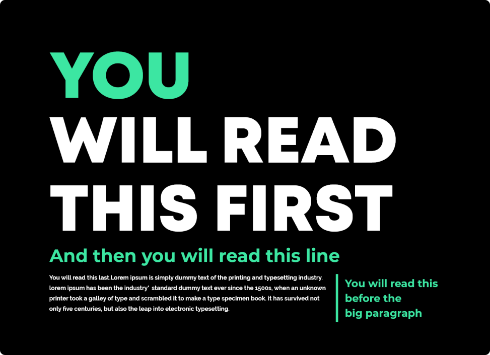
At its core, visual hierarchy is the arrangement and presentation of design elements in a way that prioritizes their importance. It's the art of guiding the viewer's eye through a piece of content, ensuring they see and understand the most important information first. Visual hierarchy is all about creating a clear and logical order of visual elements based on their significance.
The Principles of Visual Hierarchy
Size: Larger elements tend to grab more attention. By making an element bigger, you can emphasize its importance. For instance, headlines are often larger than body text to convey their significance. Color: Bright or contrasting colors can draw the eye. Using color strategically can highlight important buttons, links, or calls to action within your design.
Typography: Typeface choices, font weight, and text formatting play a vital role in visual hierarchy. Bold or italicized text can stand out more than regular text, helping to emphasize key points.
Spacing and Proximity: Group related elements together and provide adequate spacing between different sections. Users tend to perceive items close to each other as related.
Alignment: Elements aligned along a common axis create a sense of order and structure. Center-aligned or left-aligned content can influence how users navigate through information.
Contrast: Creating contrast between elements can make them stand out. This can include contrasting colors, font sizes, or background shades.
How Visual Hierarchy Influences User Engagement
First Impressions: Visual hierarchy is your first opportunity to make a positive impression. It helps users quickly grasp the purpose and content of your design.
Guiding Attention: Users are more likely to focus on elements that stand out. Effective visual hierarchy guides users' attention to critical information, such as headlines, navigation menus, or important call-to-action buttons.
Readability: Clear visual hierarchy enhances readability. It ensures that users can scan content effortlessly and find what they're looking for without feeling overwhelmed
User Flow: Visual hierarchy can influence the way users navigate through your design. By strategically placing elements, you can lead users through a specific user flow, such as from a landing page to a product page to a checkout.
Conversion Rates: In e-commerce and marketing, visual hierarchy directly impacts conversion rates. By making the "Add to Cart" button or "Subscribe Now" option more prominent, you can encourage users to take desired actions.
Brand Perception: Consistent use of visual hierarchy reinforces your brand identity. It helps users recognize and remember your brand's style and messaging.
Conclusion
In the world of design, visual hierarchy is a powerful tool that can greatly influence user attention and engagement. By understanding and applying the principles of visual hierarchy in your designs, you can create more effective and user-friendly experiences that resonate with your audience. It's not just about making things look good; it's about helping users interact with your content more intuitively and efficiently. So, the next time you embark on a design project, remember the impact of visual hierarchy—it's your secret weapon for captivating user engagement.
