
Emiliya Georgieva
20 May
5 mins read
- Copy link
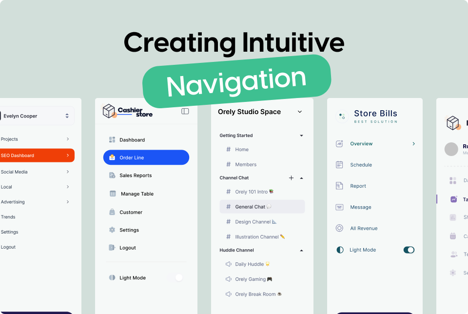
Creating Intuitive Navigation: Best Practices for UX/UI Design
1. Understand User Behavior
To design effective navigation, you need to understand how users interact with your site. Conduct user research, including surveys and usability testing, to gather insights on user expectations and behaviors.
Heatmaps and Click Tracking
Use tools like heatmaps and click tracking to see where users click the most and how they move through your site. This data helps identify popular paths and potential pain points in navigation.
2. Simplify the Navigation Structure
A clear and simple navigation structure helps users find information quickly.
Limit Menu Items
Avoid overwhelming users with too many choices. Aim for no more than 7 main menu items.
Use Descriptive Labels
Menu labels should be concise and clearly describe the content they link to. Avoid jargon or overly technical terms.
3. Implement a Logical Hierarchy
Organize content in a logical manner to guide users intuitively through your site.
Categorization
Group related items under a common category. For example, under "Products," you might have "Laptops," "Desktops," and "Accessories."
Breadcrumb Navigation
Breadcrumbs show users their current location within the site's hierarchy, making it easy to navigate back to previous sections.
4. Ensure Consistency
Consistent navigation elements help users predict and understand how to move through your site.
Fixed Navigation Bars
Use fixed (or sticky) navigation bars that remain visible as users scroll. This ensures that navigation options are always accessible.
Consistent Positioning
Keep navigation elements in the same place on every page. For example, if your menu is at the top of the homepage, it should be at the top of all pages.
5. Optimize for Mobile Devices
With the increasing use of mobile devices, it’s essential to ensure your navigation works seamlessly on smaller screens.
Hamburger Menus
Use a hamburger menu (three horizontal lines) to hide and reveal the main navigation on mobile devices, saving screen space.
Touch-Friendly Elements
Ensure that buttons and links are large enough to be easily tapped with a finger.
6. Utilize Visual Hierarchy
Visual cues help users understand the importance and relationship between different elements.
Size and Color
Use larger font sizes and bolder colors for primary navigation items. Secondary items can be smaller and less prominent.
Whitespace
Use whitespace effectively to separate navigation items and prevent a cluttered appearance.
7. Include Search Functionality
A search bar provides an alternative navigation method, especially for large sites with extensive content.
Prominent Placement
Place the search bar in a visible location, typically in the header or top right corner.
Auto-Suggestions
Implement auto-suggestions to help users find what they’re looking for faster.
8. Provide Feedback and Context
Users should always know where they are and what actions they can take next.
Active States
Highlight the current page or section in the navigation to provide context. For example, if a user is on the "About Us" page, the corresponding menu item should be visually distinct.
Hover Effects
Use hover effects to indicate clickable elements and improve user interaction.
Conclusion
Designing intuitive navigation is a fundamental aspect of effective UX/UI design. By understanding user behavior, simplifying the navigation structure, maintaining consistency, and optimizing for all devices, you can create a seamless and enjoyable experience for your users. Implement these best practices to ensure your navigation guides users effortlessly through your site, enhancing their overall experience.